Remote Stream
Direction Two - Abbey Inspired
The origins of Cambridge United can be found in Abbey United, the Club’s name from 1912 to 1948...
The name is believed to come from the Abbey Church on Newmarket Road, which still stands to this day.
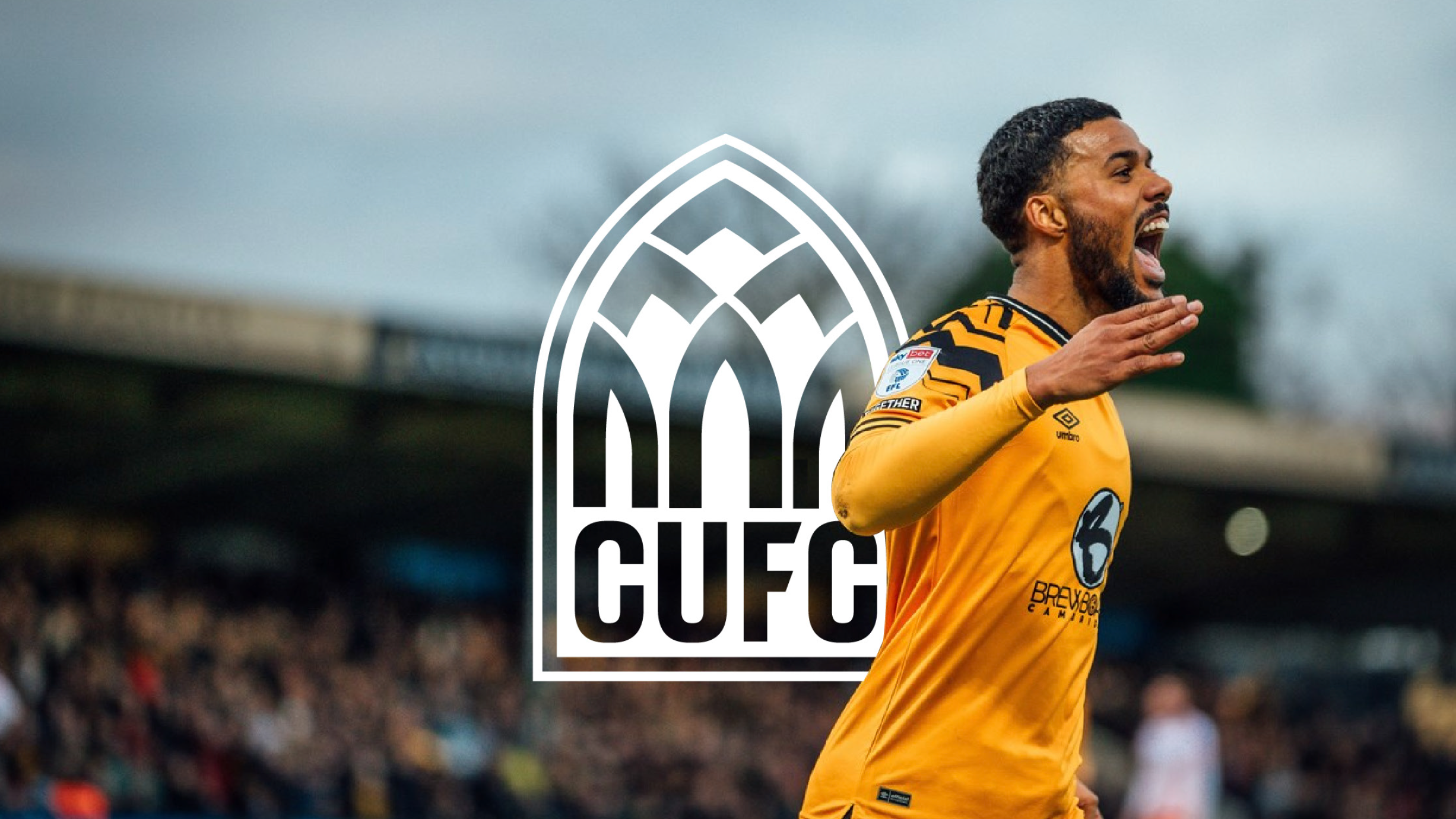
Direction Two celebrates the Club’s origins, and former name, bringing elements of the Abbey into the badge, and forms an interesting bond with Cambridge’s beautiful city-centre architecture.

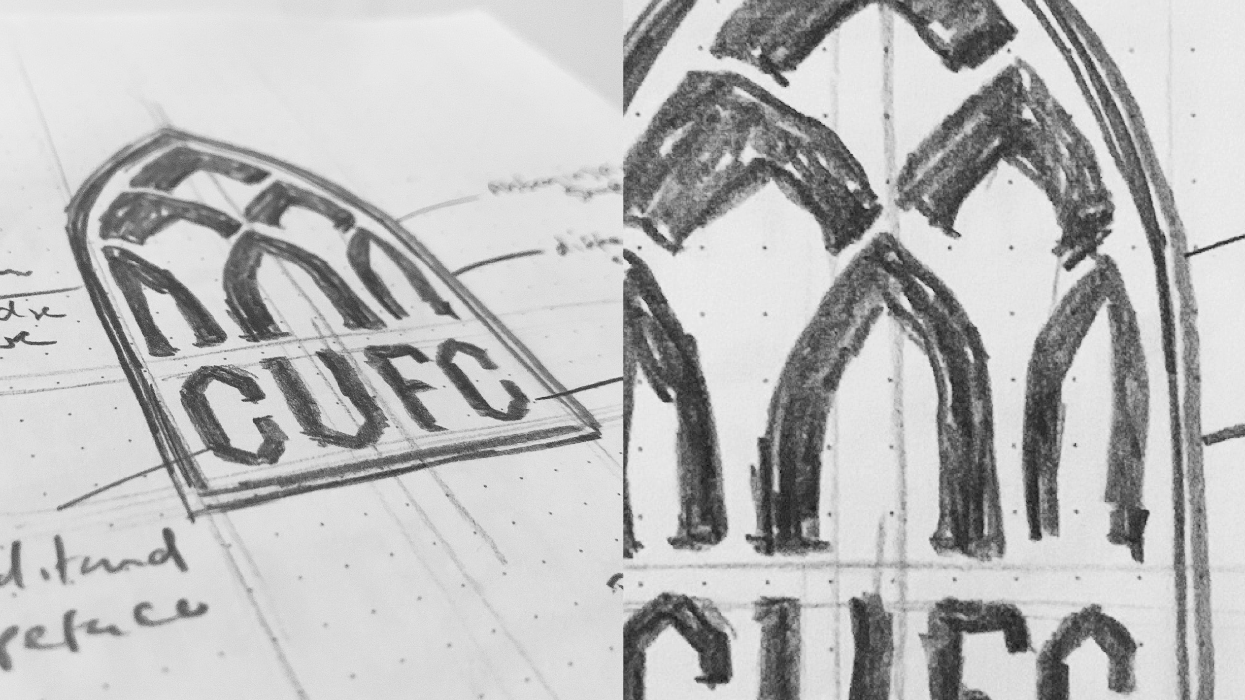
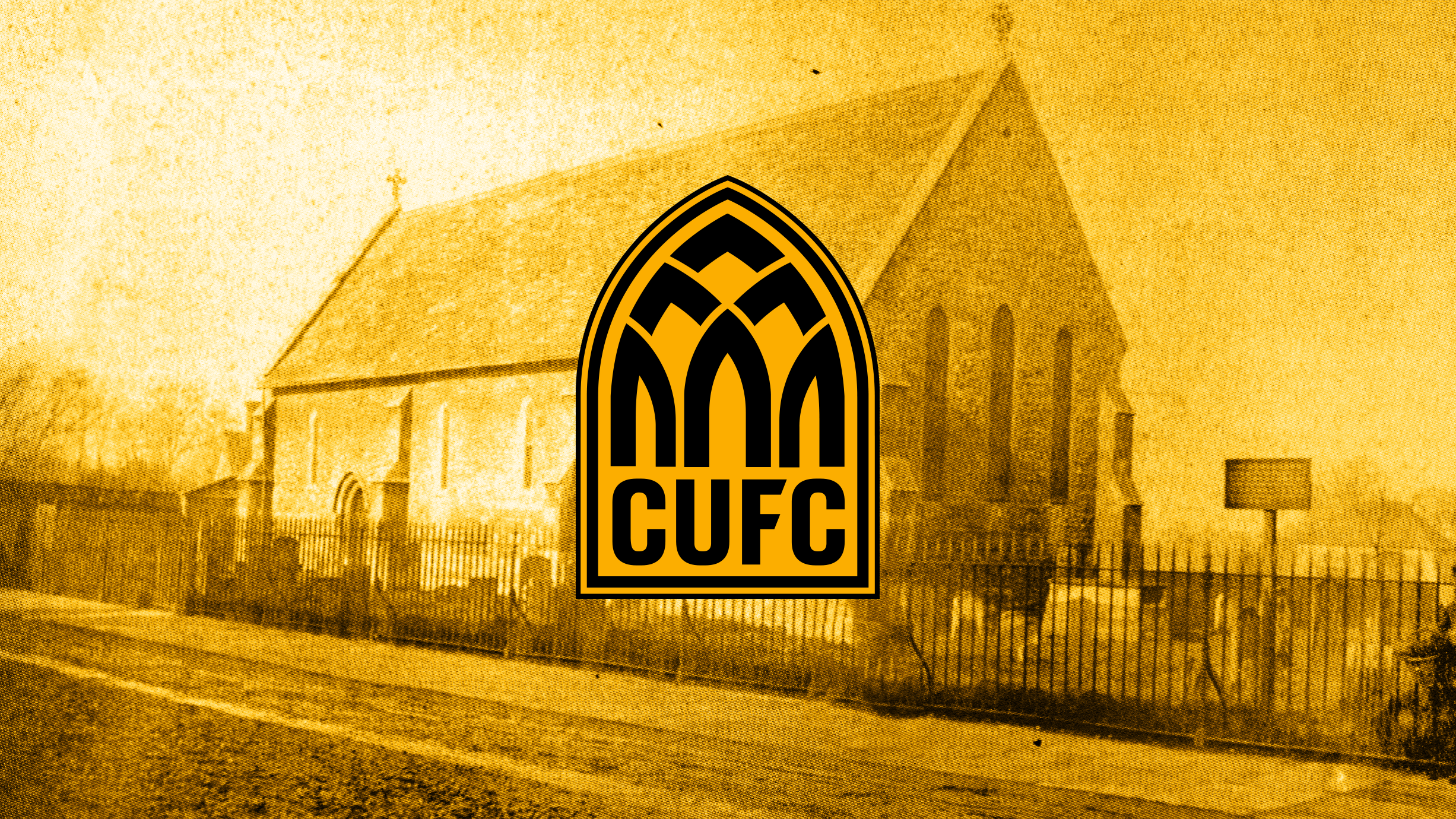
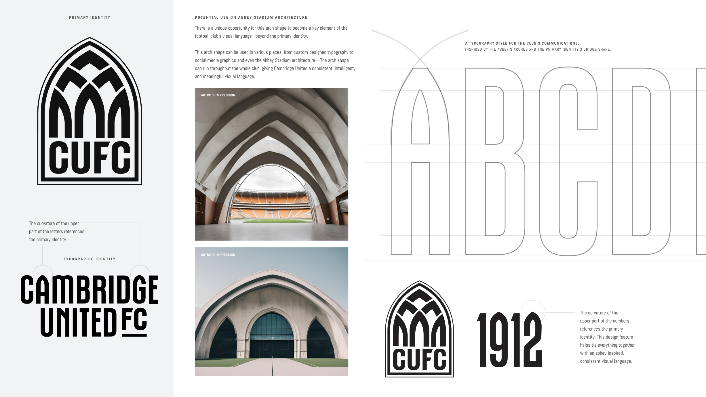
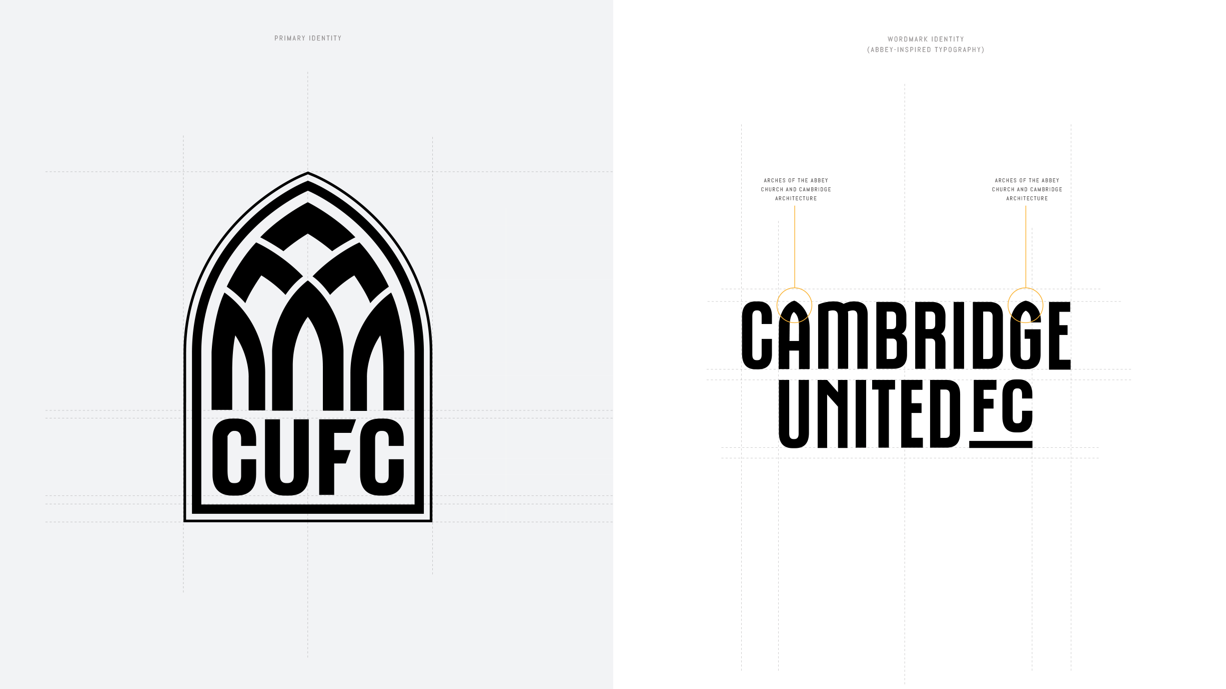
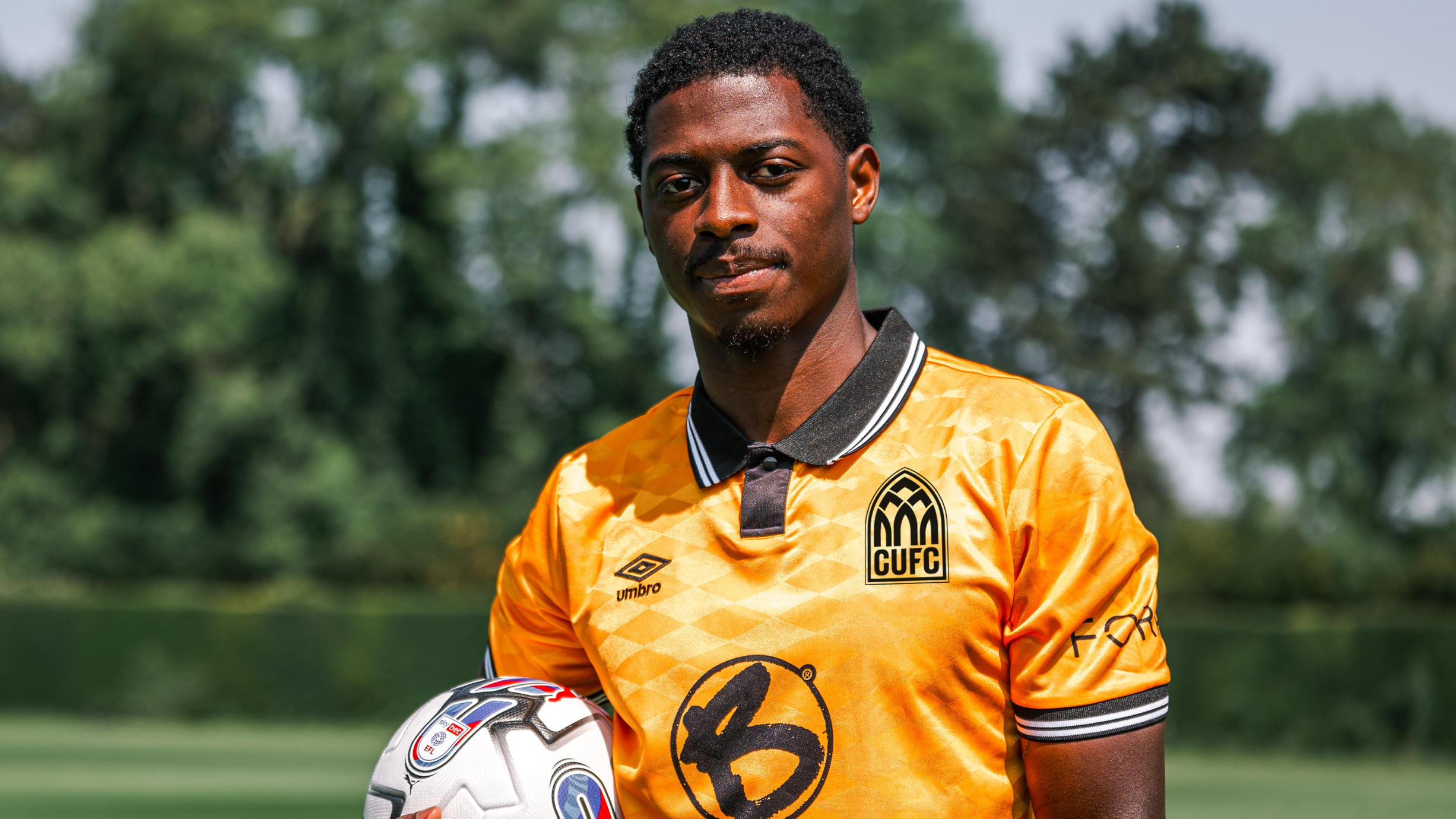
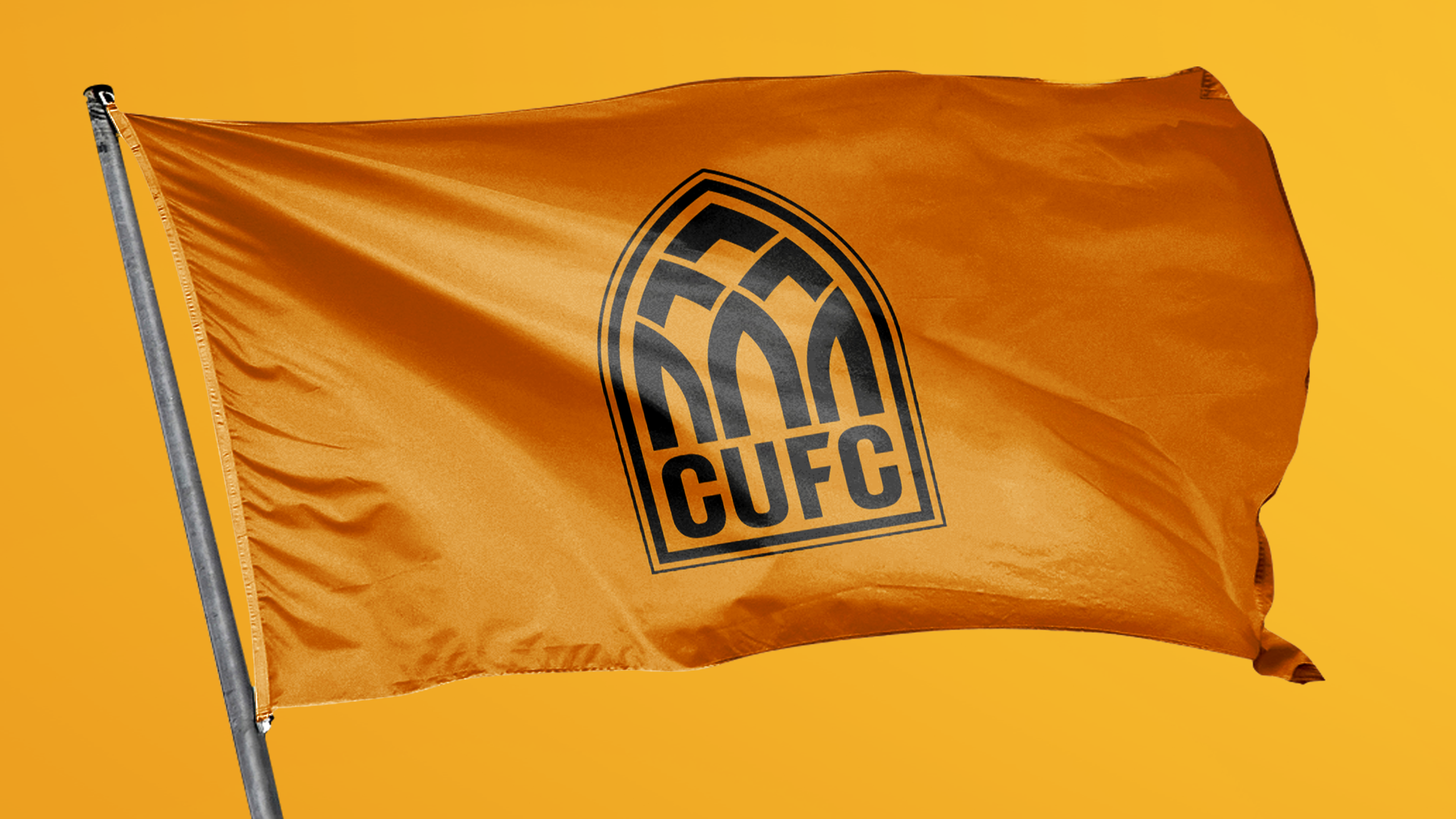
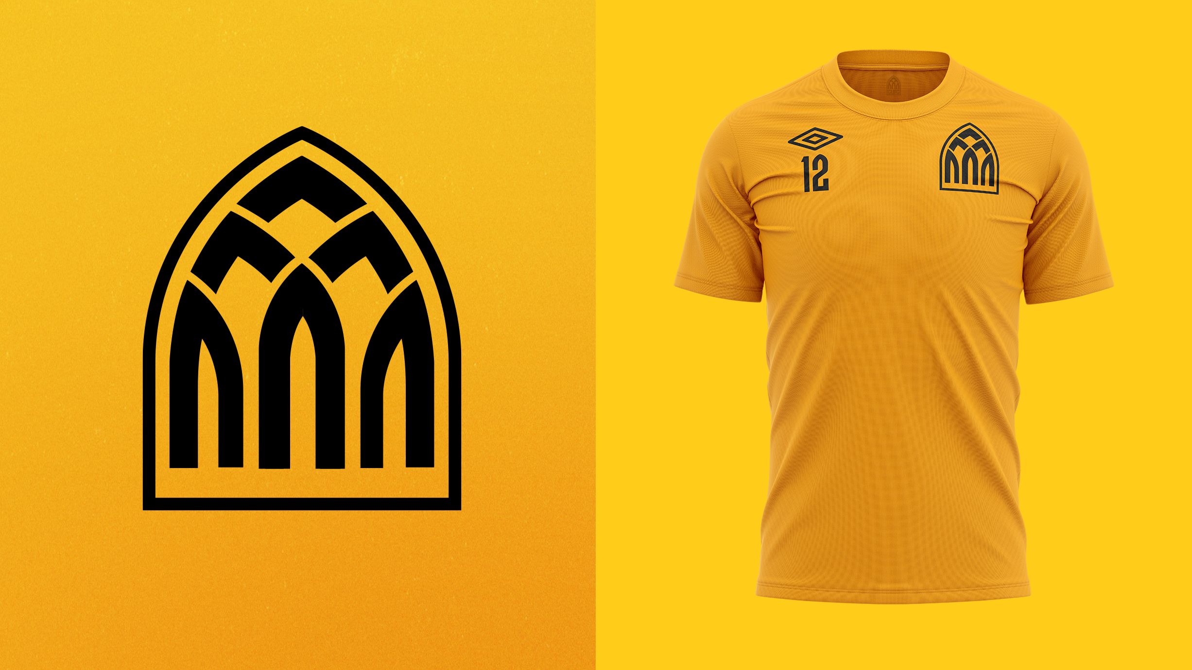
This design takes its shape from the arched windows and doorways of the Abbey Church but also a shape which is present across much of Cambridge’s world-famous architecture. This offers the Club a truly unique badge.
Image
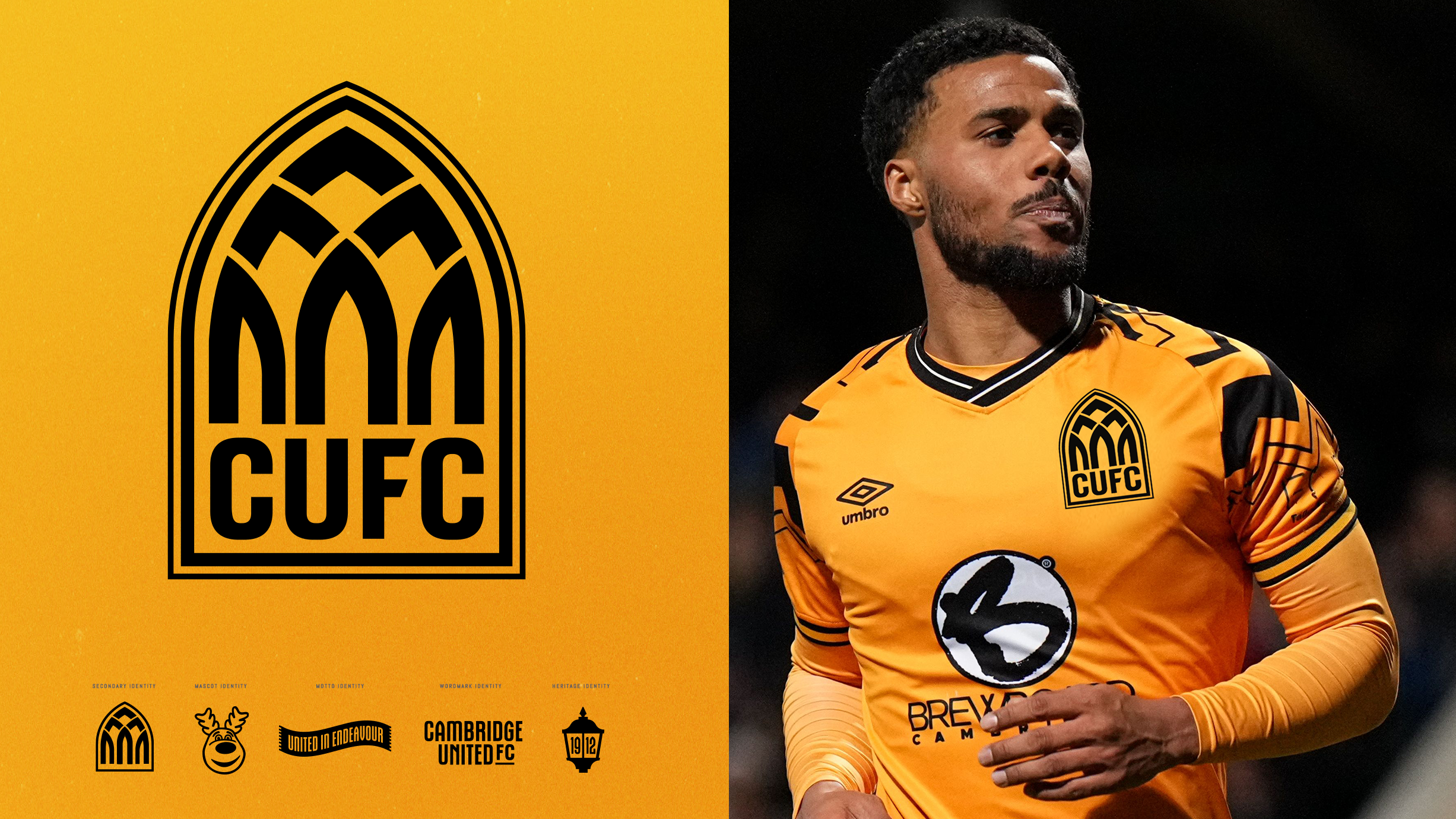
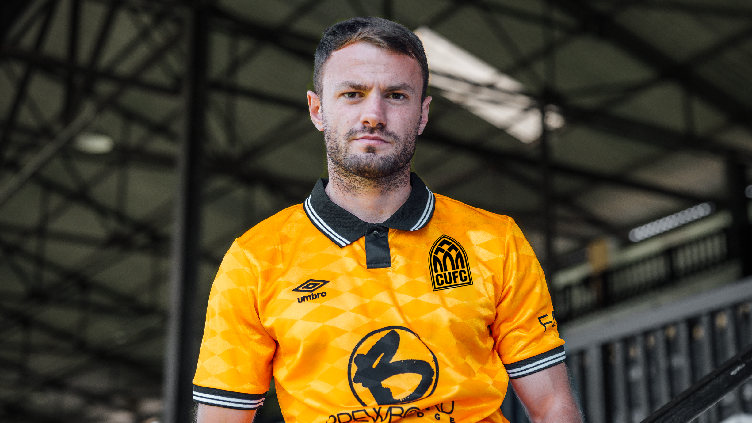
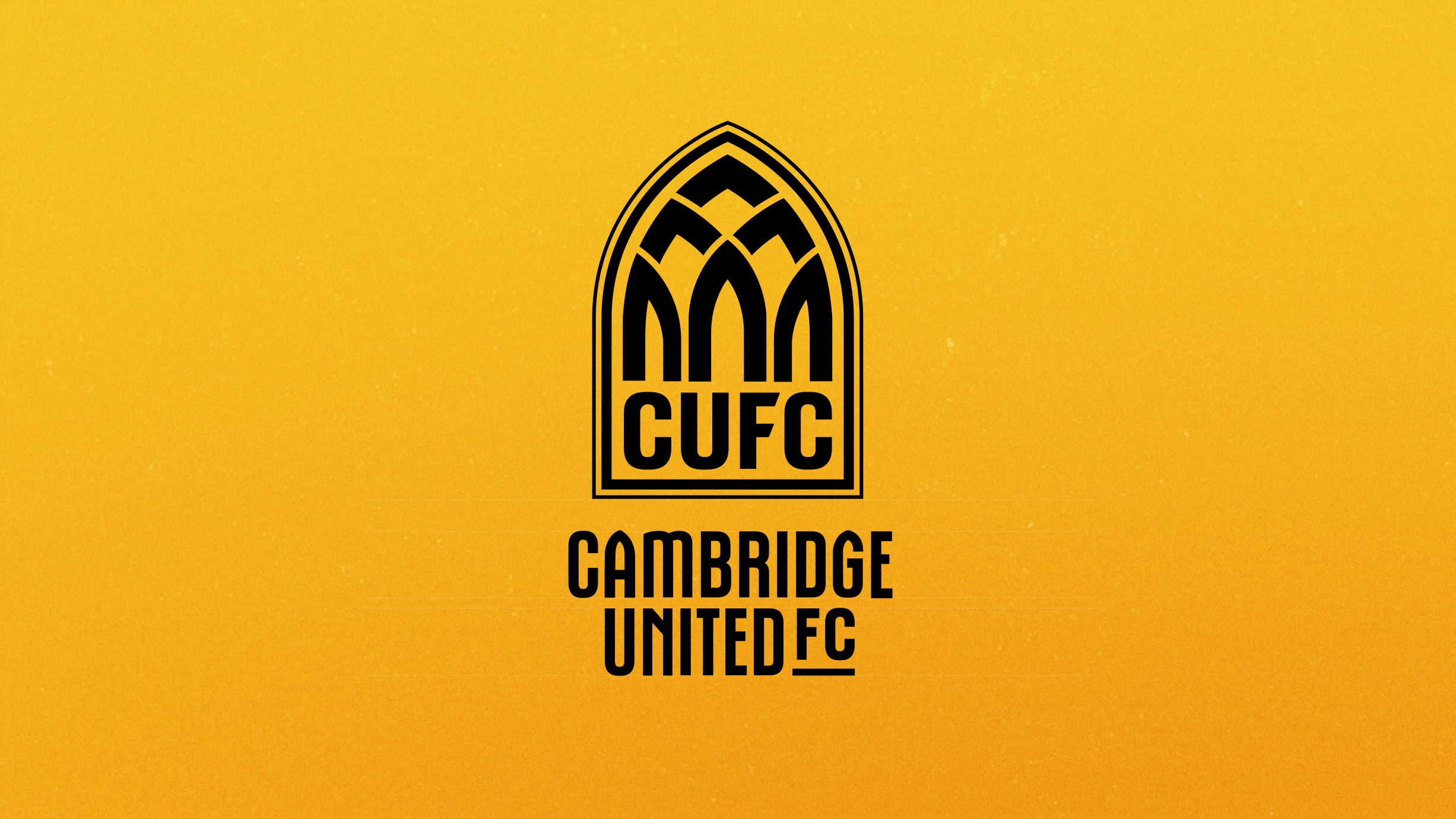
This is a unique and distinctive option that brings the Abbey to the forefront of our identity, pays homage to our heritage and represents our city, whilst also being progressive and bold in its look and feel.

Designed to adapt
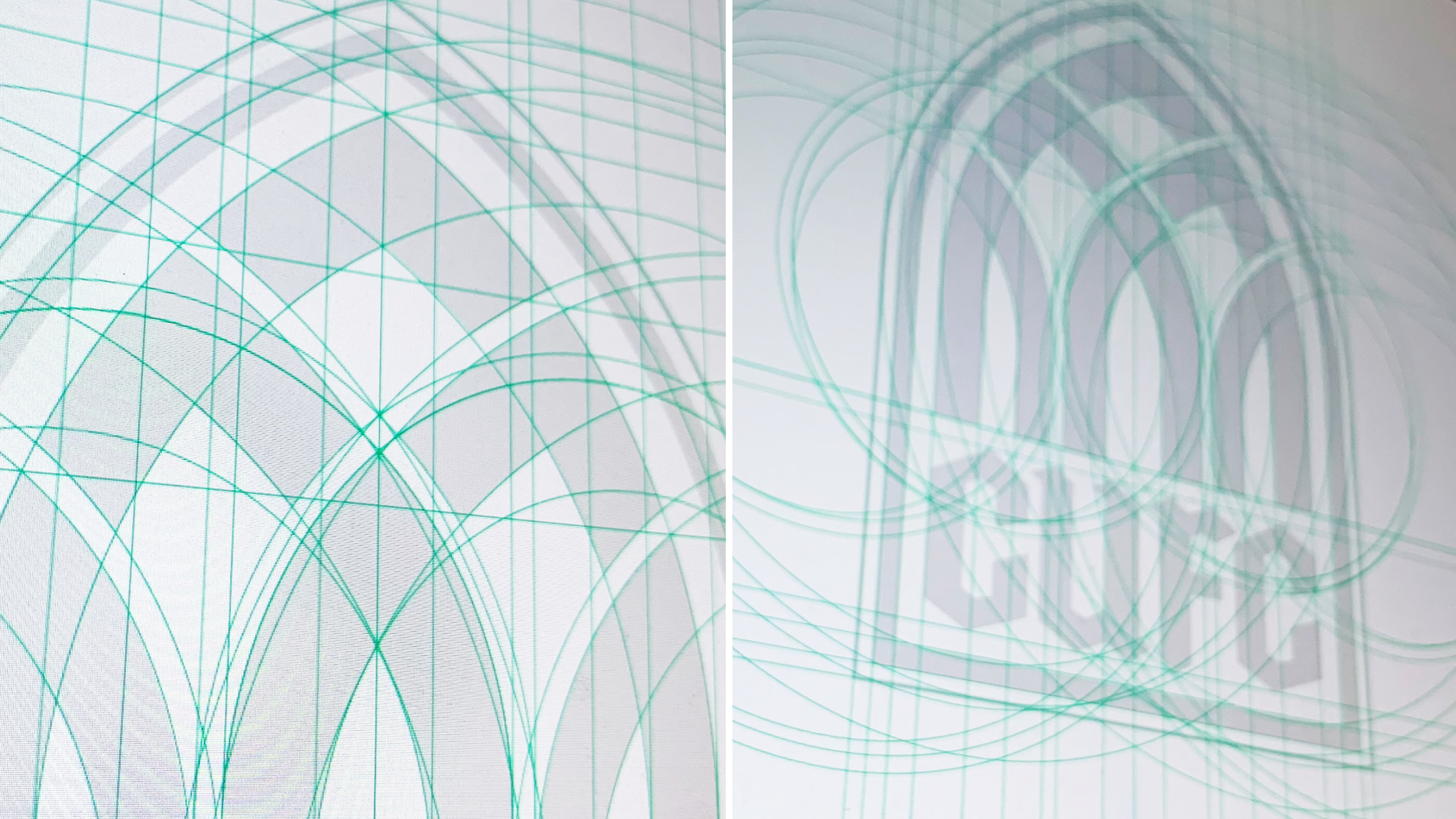
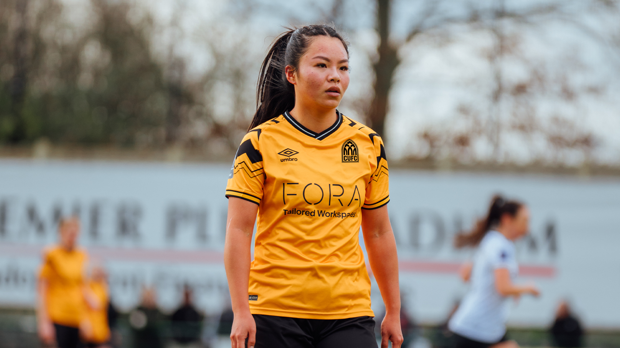
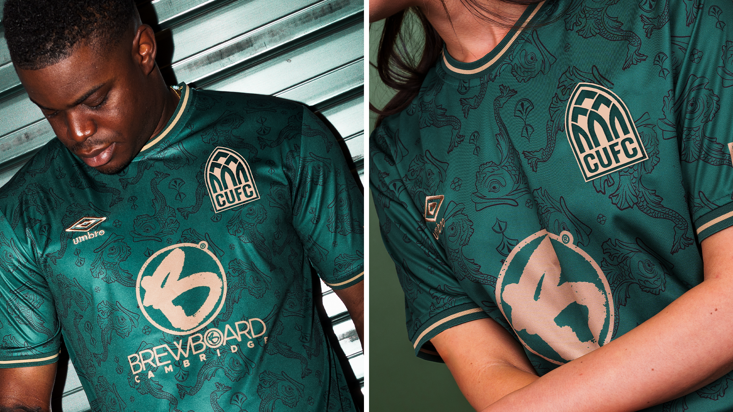
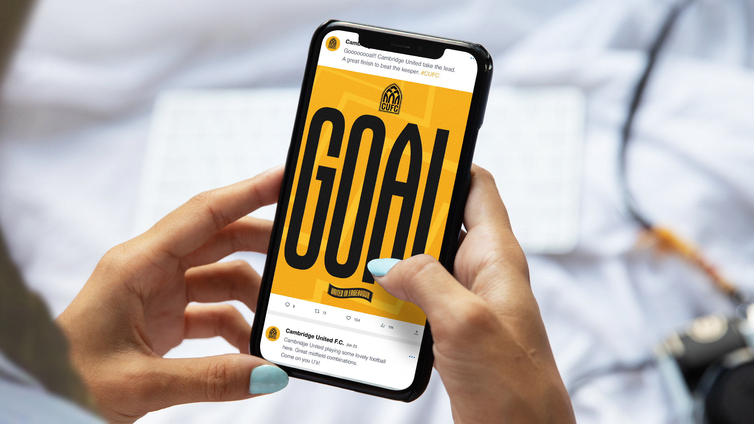
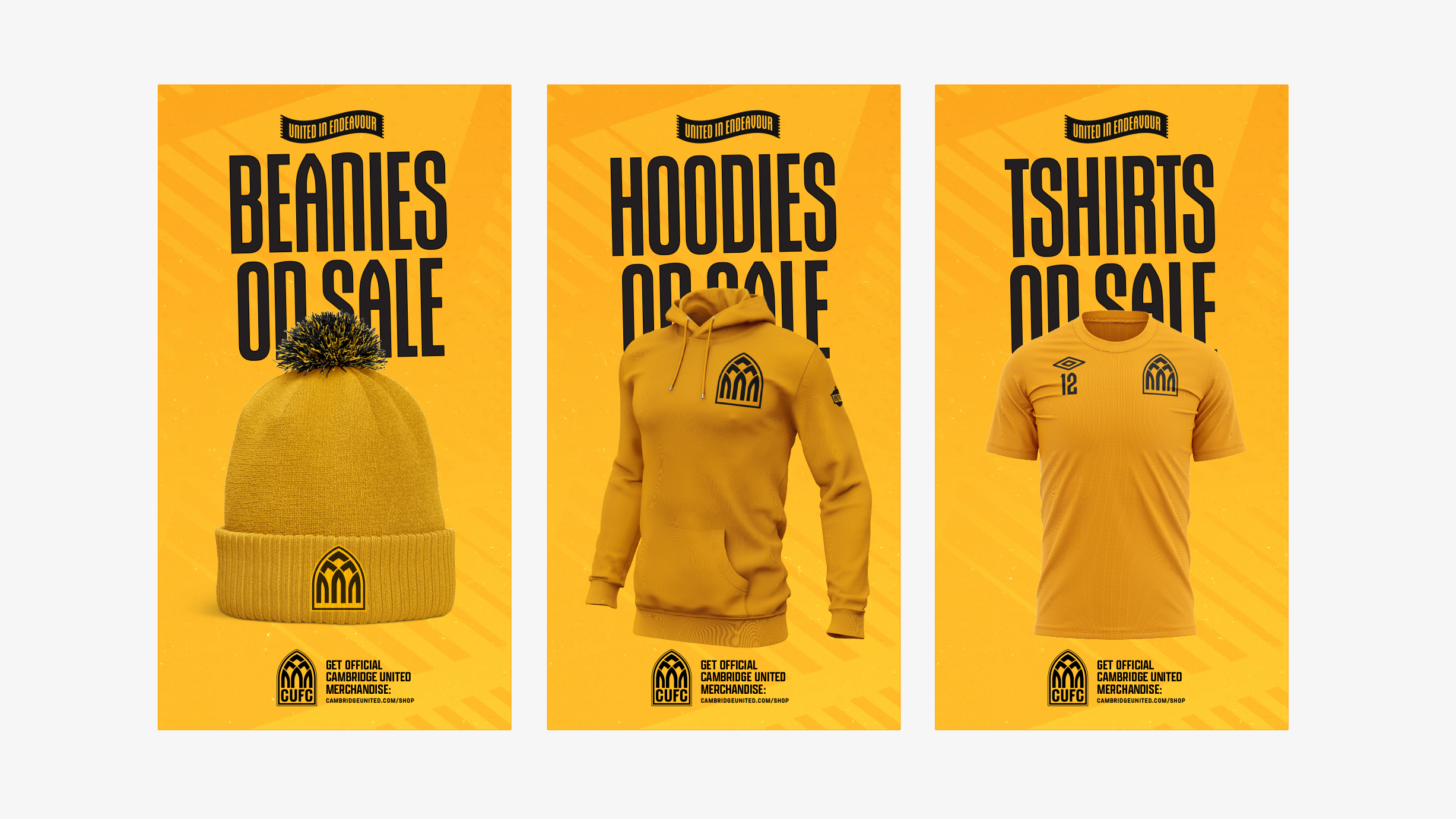
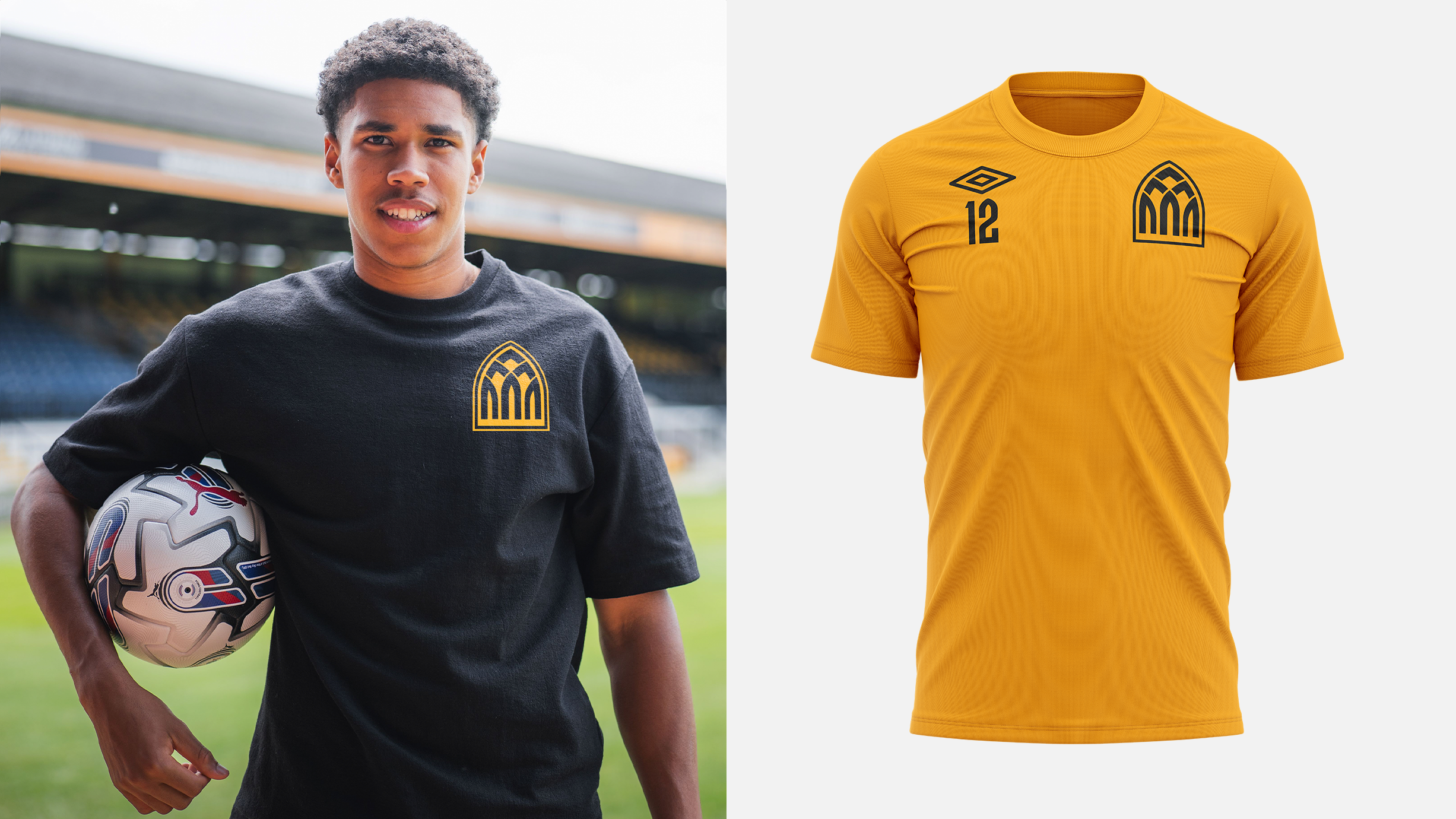
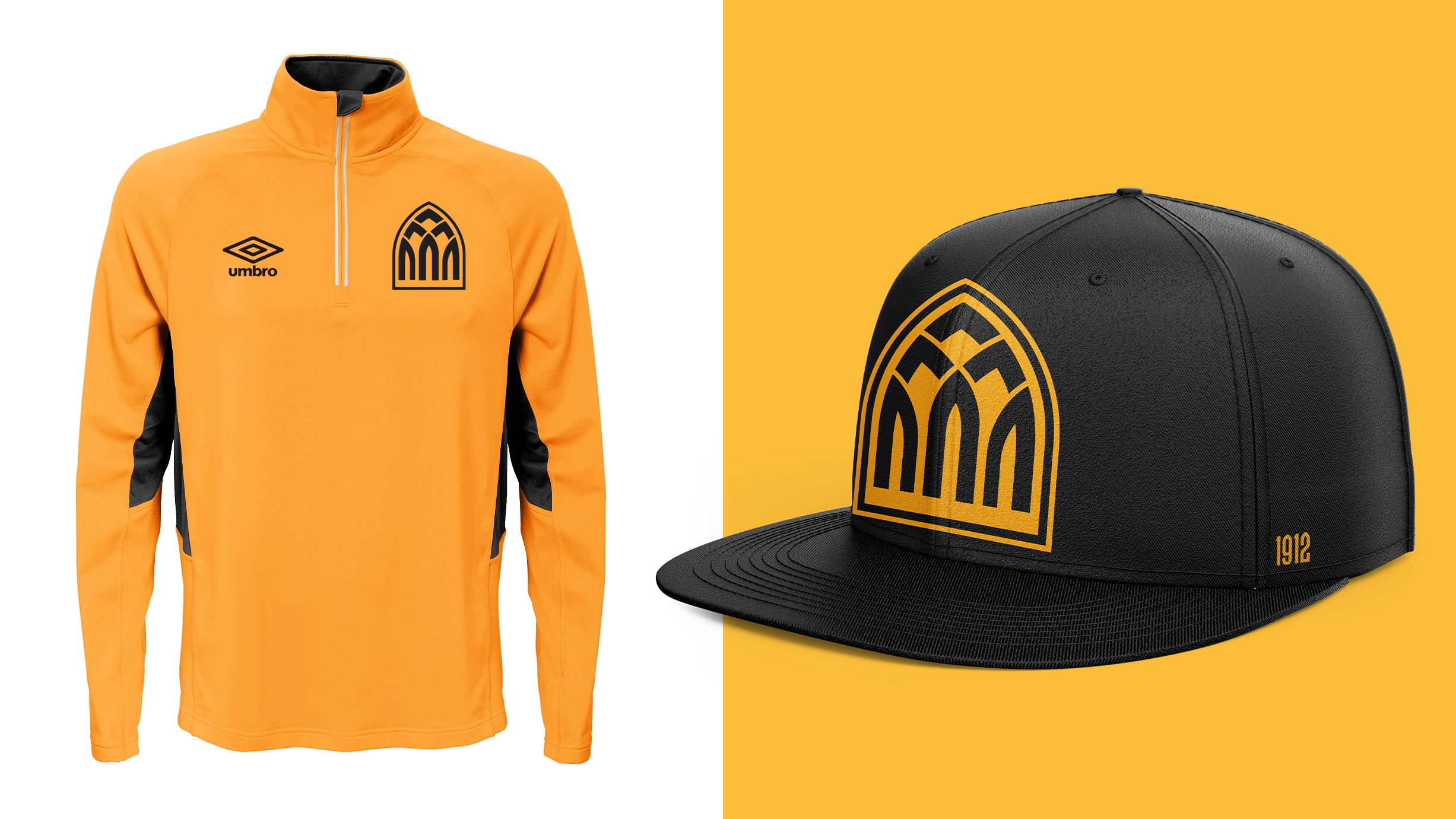
Like Direction One, a key feature of this design is its flexibility. In today's modern world, it is important that a football club’s identity can adapt to multiple scenarios.
This new identity was designed to work across all places in which it will be seen - from social media to print media, large sizes to smaller sizes.
In addition, this identity was designed to change colour when needed.
Image

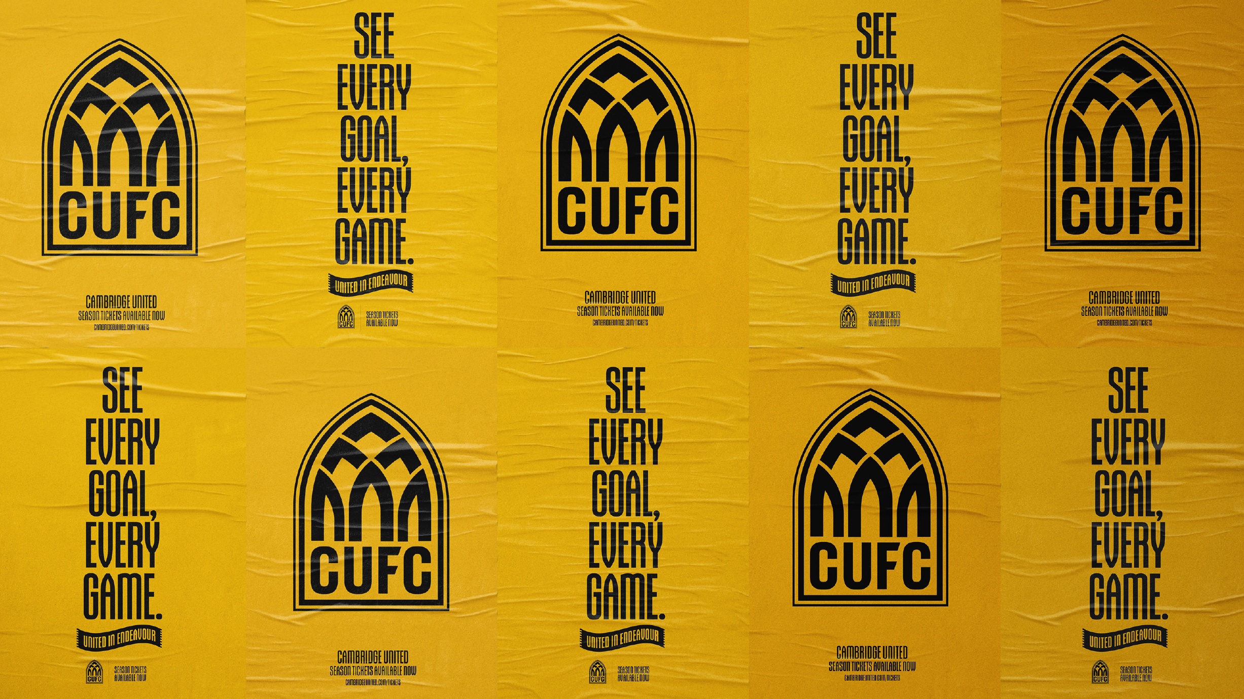
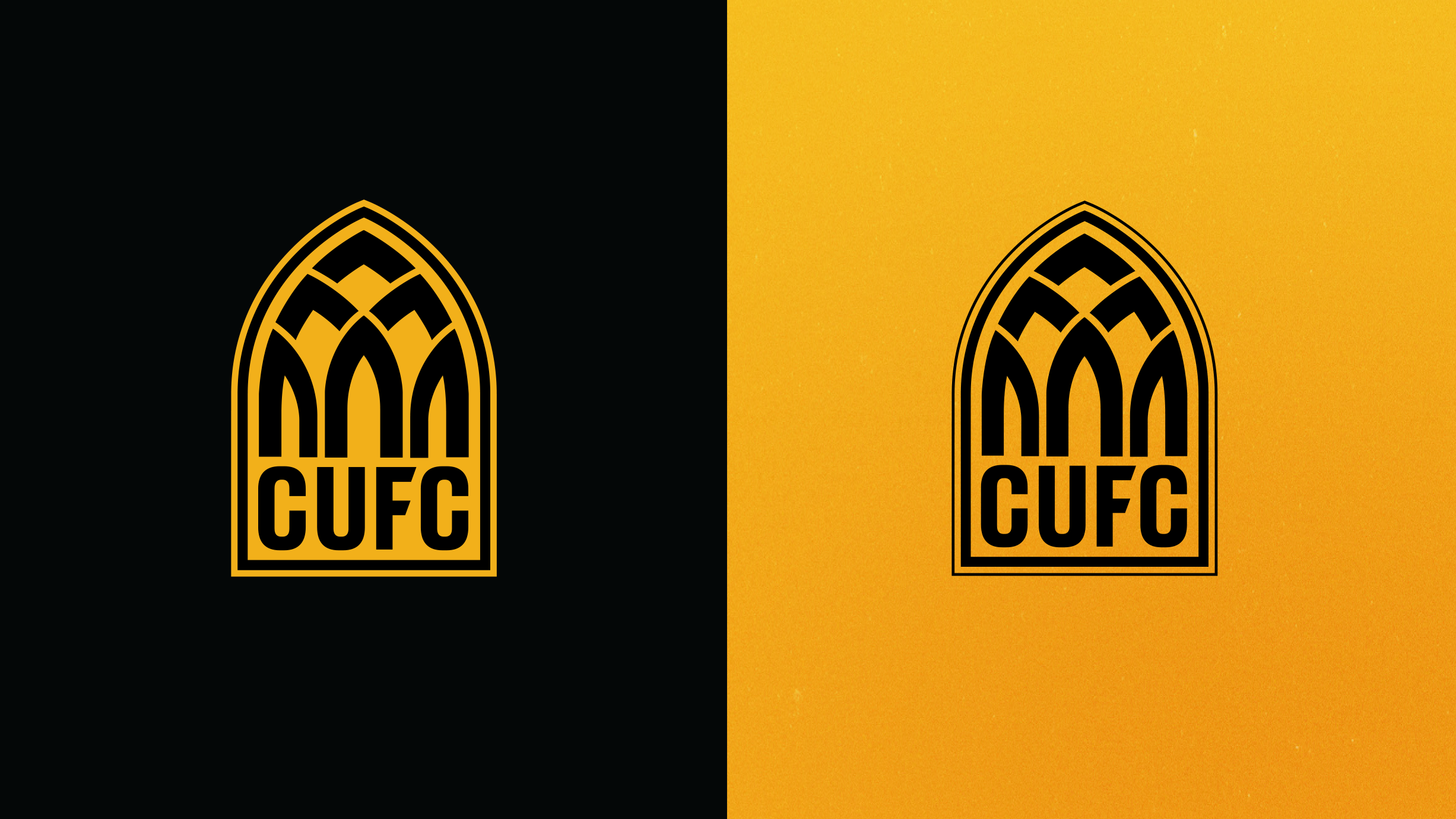
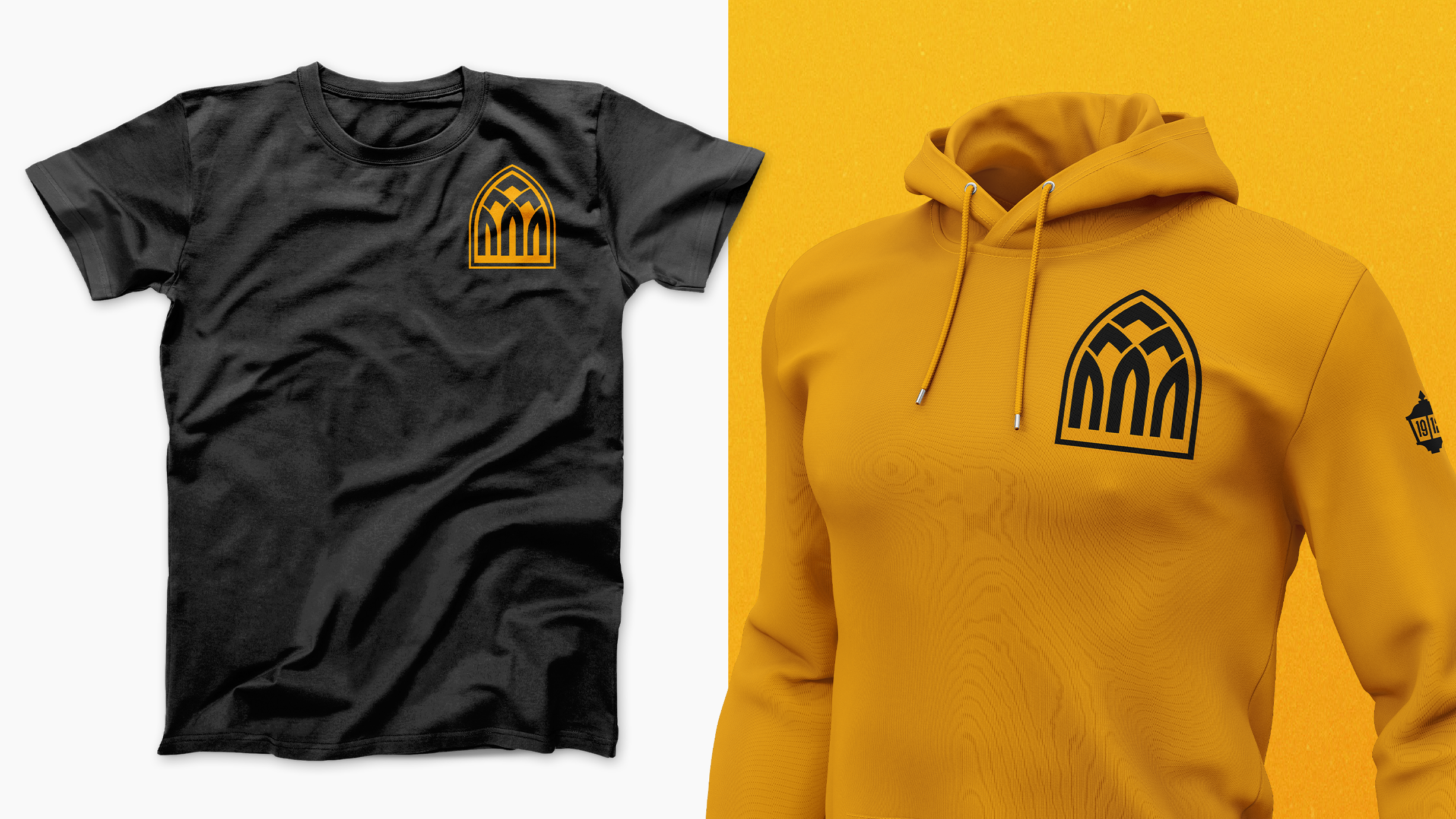
Secondary identity
This progressive new identity can also be simplified further when needed. Our club’s initials CUFC can be removed, leaving just the unique arch shape as a representation of the Abbey and Cambridge’s architecture.
This simplified version of the identity can be used across training kits and select merchandise offering the Club more flexibility, and offering our fans more choice, and more ways to represent the Club.
Image
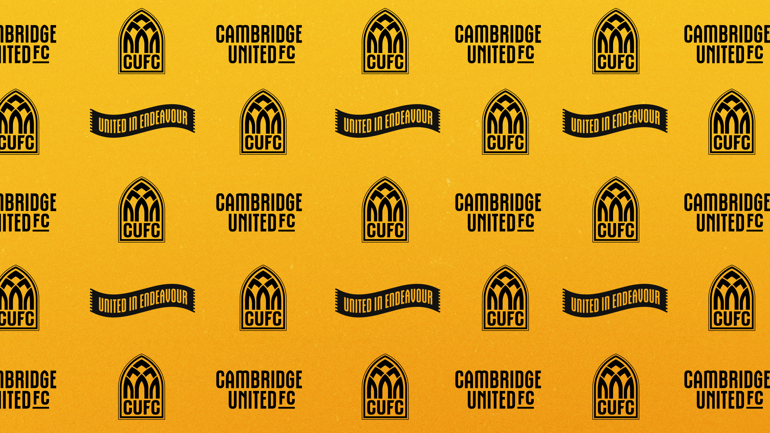
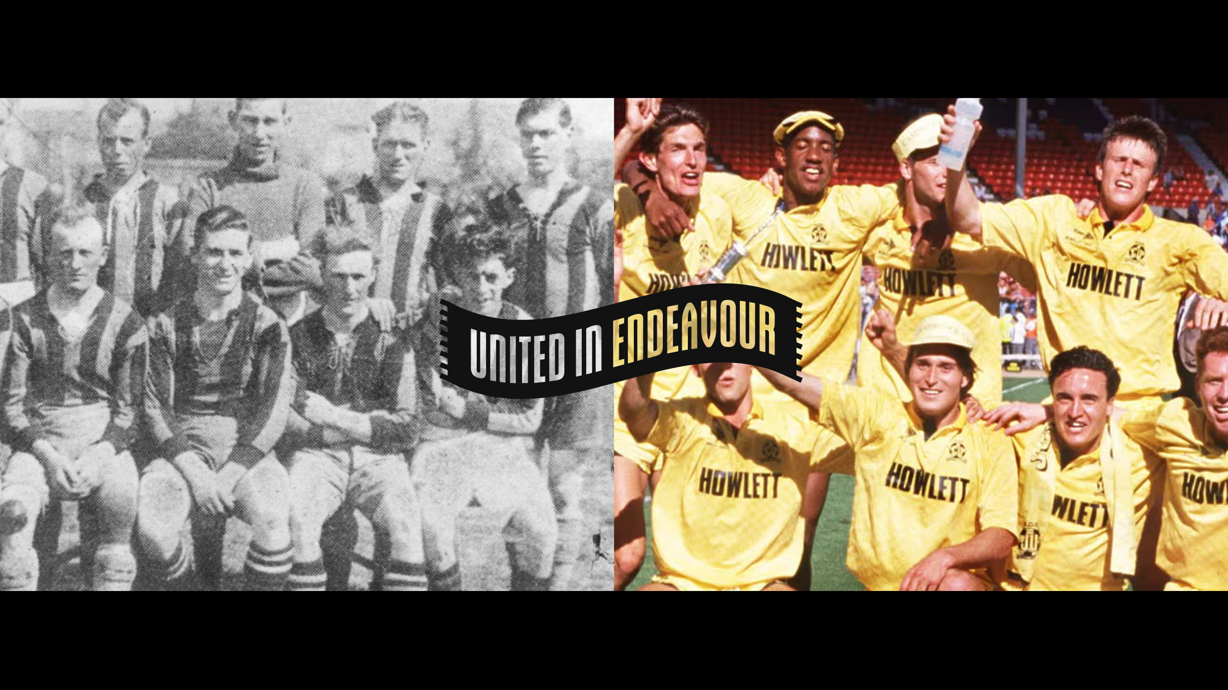
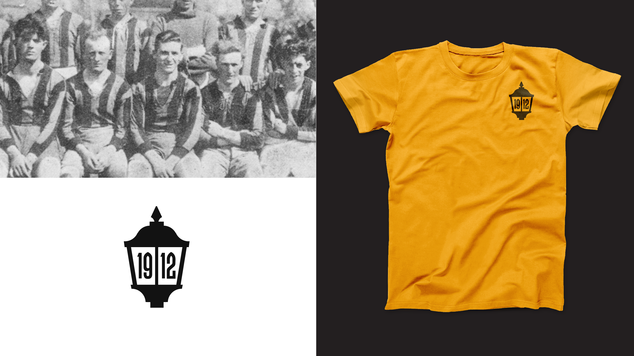
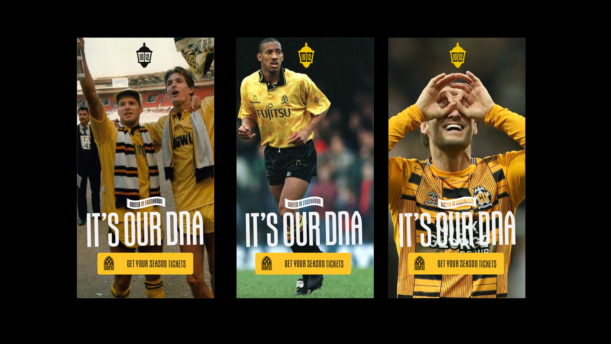
United in Endeavour, 1912 and other ways to represent
The Abbey Inspired identity system includes a scarf based ‘United in Endeavour’ motto identity, that is similar to the one associated with the Evolution Crest, but also a lamppost styled ‘1912’ heritage identity that aligns with the Primary Crest, by being influenced by the city's architecture.
Unique to this Crest identity system is a custom typeface which is inspired by the arches of the Abbey and the primary identity.
Image
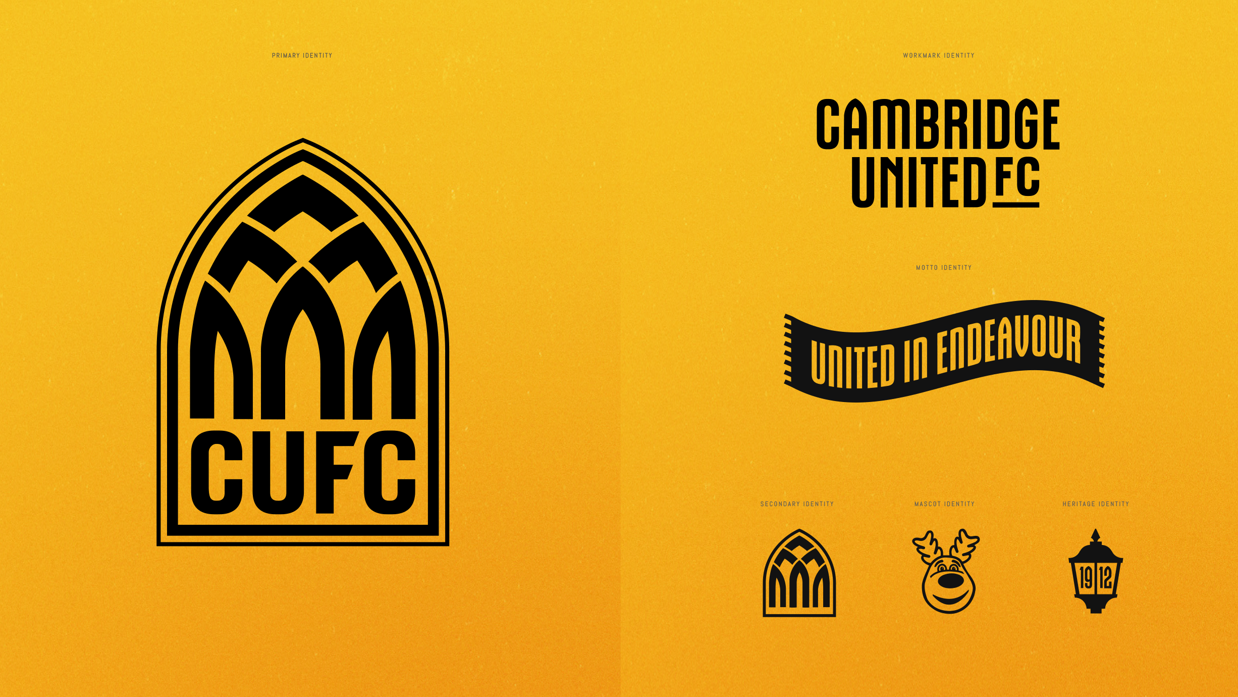
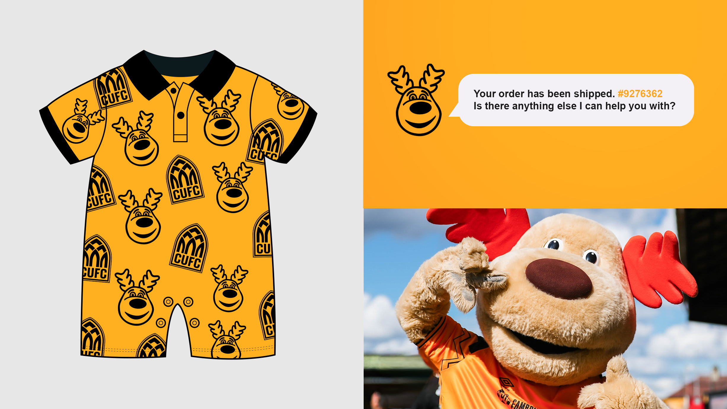
Marvin the Moose also has his own visual identity. As the Club continues to grow its junior supporter-base, we feel it’s important that Marvin has to show his fun-loving personality across our platforms.
All aspects of the identity system are designed to work together, giving the Club a fresh, adaptable look which has meaning and the Club's history at the heart of it.
Designer Chris Payne says...
"When we reviewed the fan feedback, we had a good section of the fanbase wanting us to be brave, think differently, and be innovative with our designs - this was great to hear and it shows the forward thinking nature of Cambridge United fans.
"Direction Two was designed for the section of fans who want the Club's new identity to be bold, to stand out, and to not follow trends. We challenged ourselves to create something that would be unique to Cambridge and distinct in the world of football.
"The Abbey Inspired design is highly unique, yet its inspiration is rooted in Cambridge United's beginnings, the old Abbey Church, Abbey United, the Abbey Stadium, and Cambridge's iconic and world-famous architecture.
"I spent a lot of time in Cambridge researching this project, and one of the first things I noticed was this arch shape in abundance. You just have to spend five minutes in Cambridge city centre, and you will see this arched shape everywhere, from iconic buildings and bridges to arched windows and doors; this shape is a key part of Cambridge's identity.
"Adding to this, the arched shape is also found in the Abbey Church - this makes the design and the story behind the design even more compelling. This design ties in nicely with the foundation of the Club, the early days of Abbey United and the Abbey Stadium.
"The design, and the story behind the design is also highly scalable. There is opportunity to build a more comprehensive brand around this unique shape. I can see custom typography, brand patterns, kit designs, and even future Abbey Stadium architecture, which could take on this shape.
"If the fans genuinely want the Club to stand out, be different, yet reference the Club's past and the beauty of the city, then this is the design for them."