Remote Stream
Direction Three - Book and Ball
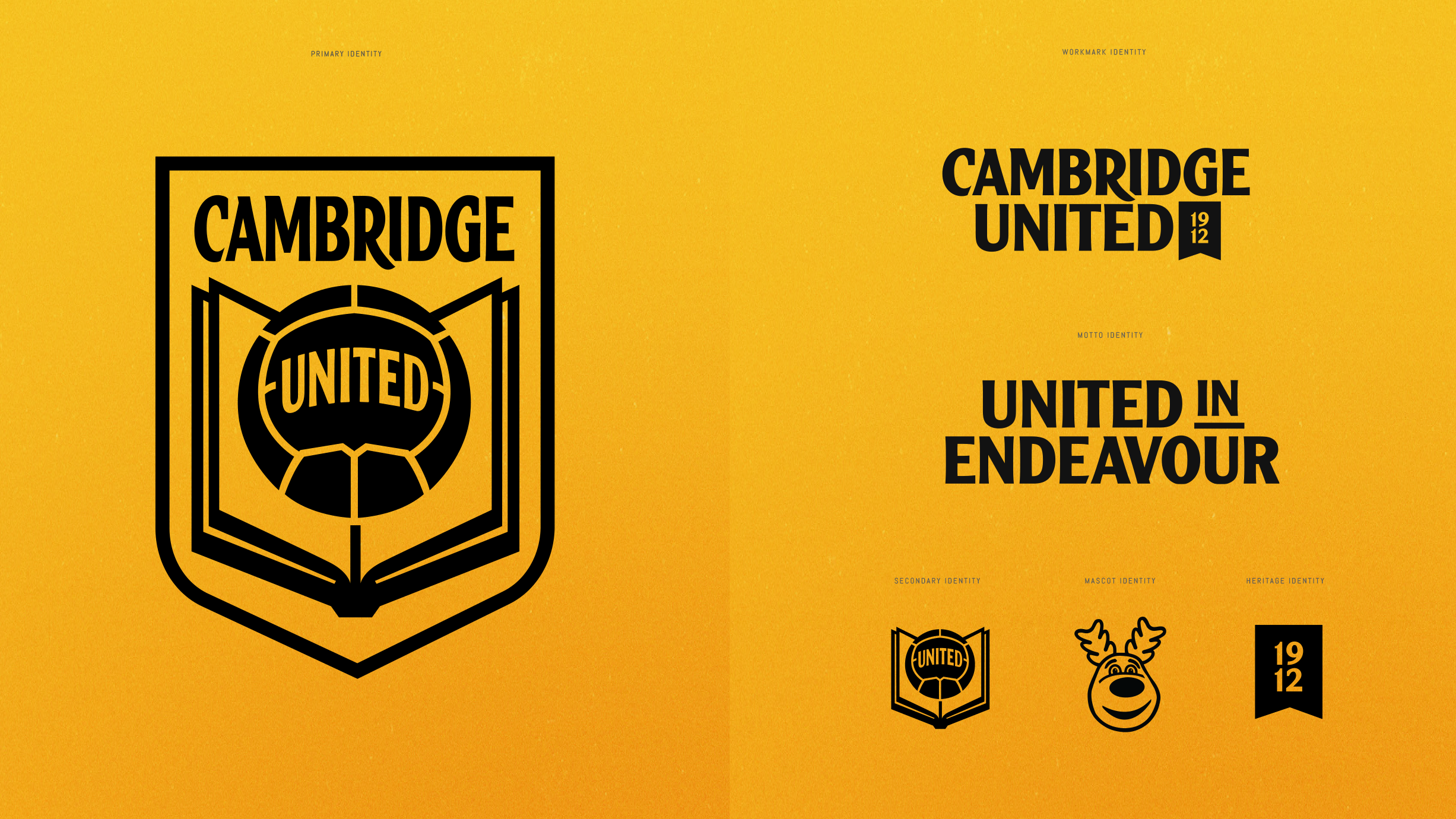
Direction Three is a call-back to a familiar symbol and Crests of the past, with a fresh and modern approach...
This design reimagines the Book and Ball which represents Cambridge as the birthplace of the Rules of the Game and the city's links to education.
Image
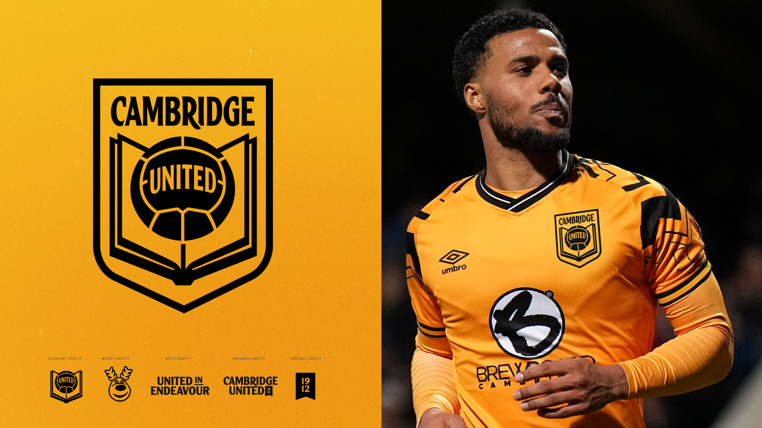


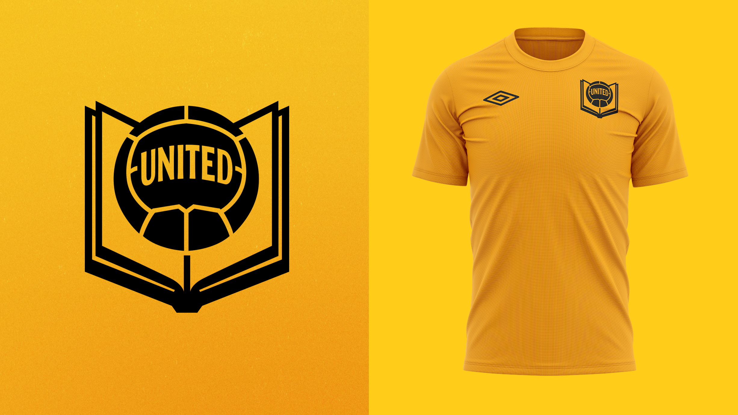
The Crest has balance, symmetry and simplicity, incorporating all of the design elements within a classic shield.
This design offers an option to supporters who would like to see a more traditional crest and the return of the book and ball.
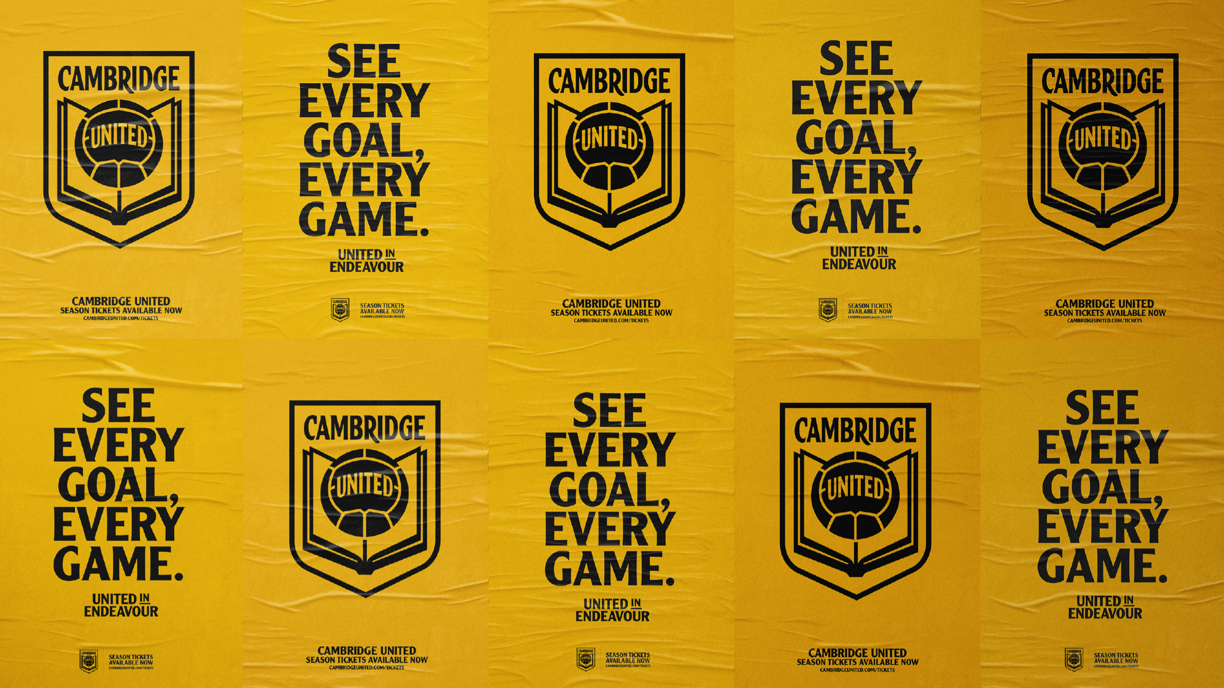
Designed to adapt...
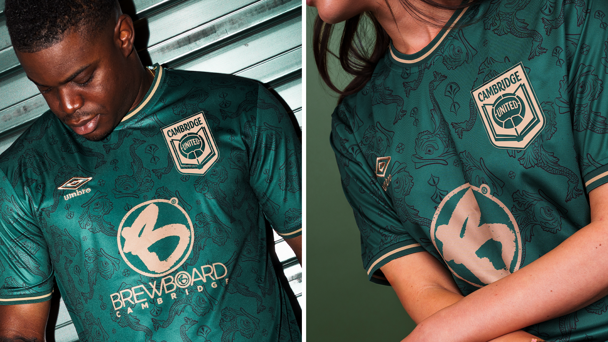
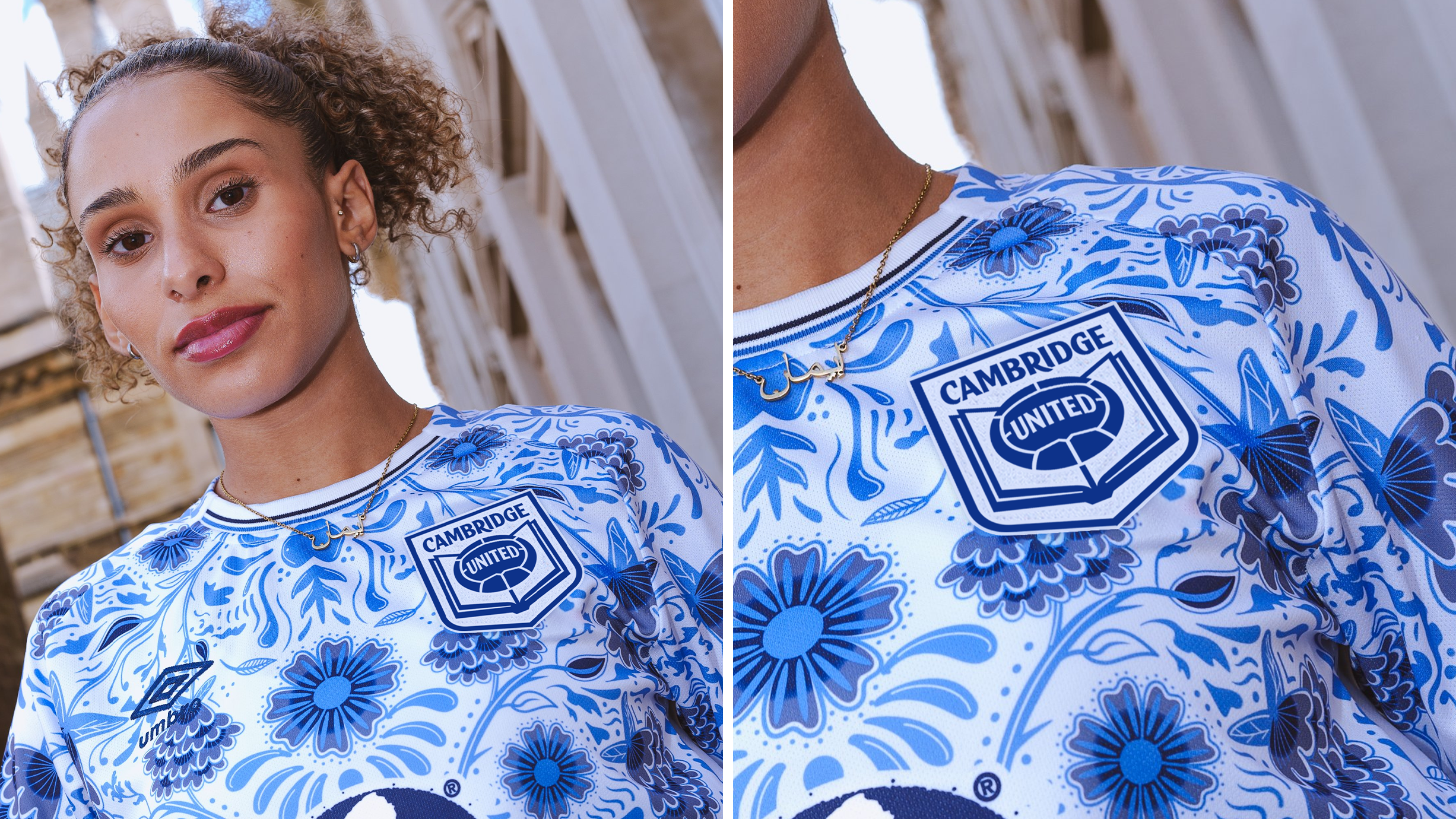
Despite being a more traditional design, Direction Three remains flexible and able to adapt to multiple scenarios and across different colours.
Image


Secondary identity
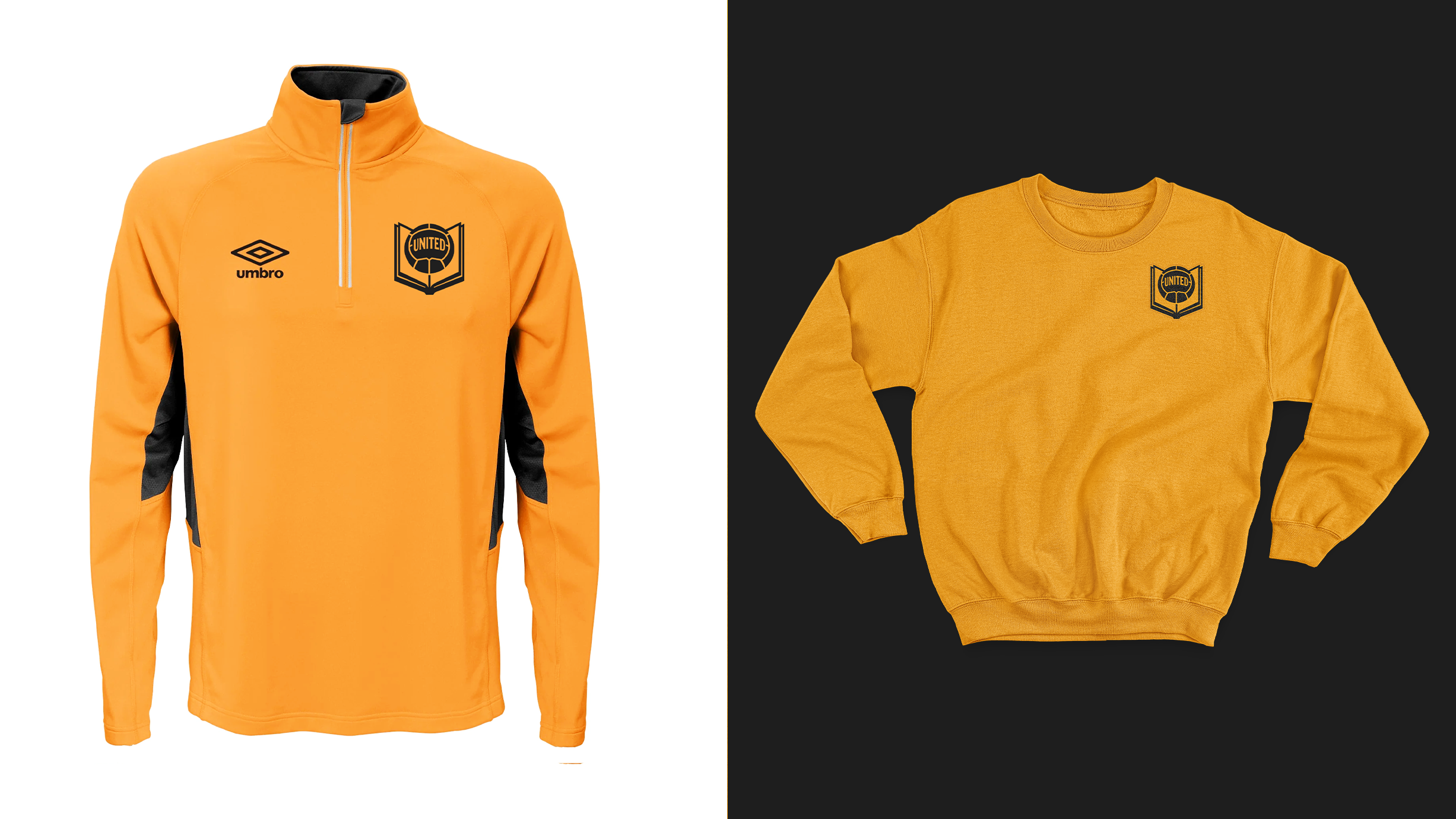
This new identity can also be simplified further when needed. The Book and Ball can extract from the shield to reveal a different version of the Crest.
This simplified version of the identity can be used across training kits and select merchandise offering the Club more flexibility, and offering our fans more choice, and more ways to represent the Club.
Image


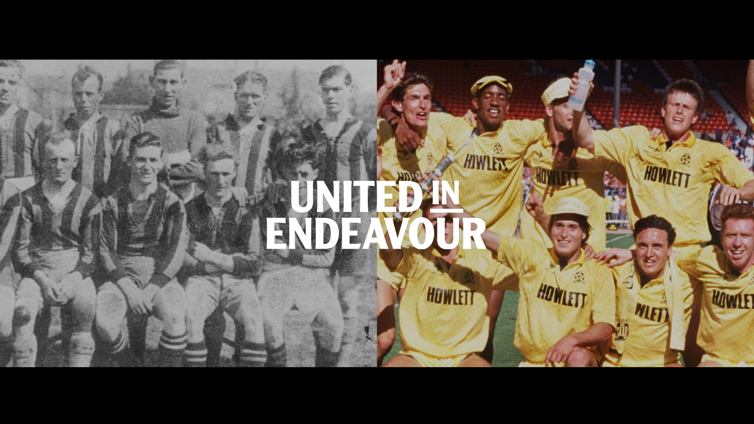
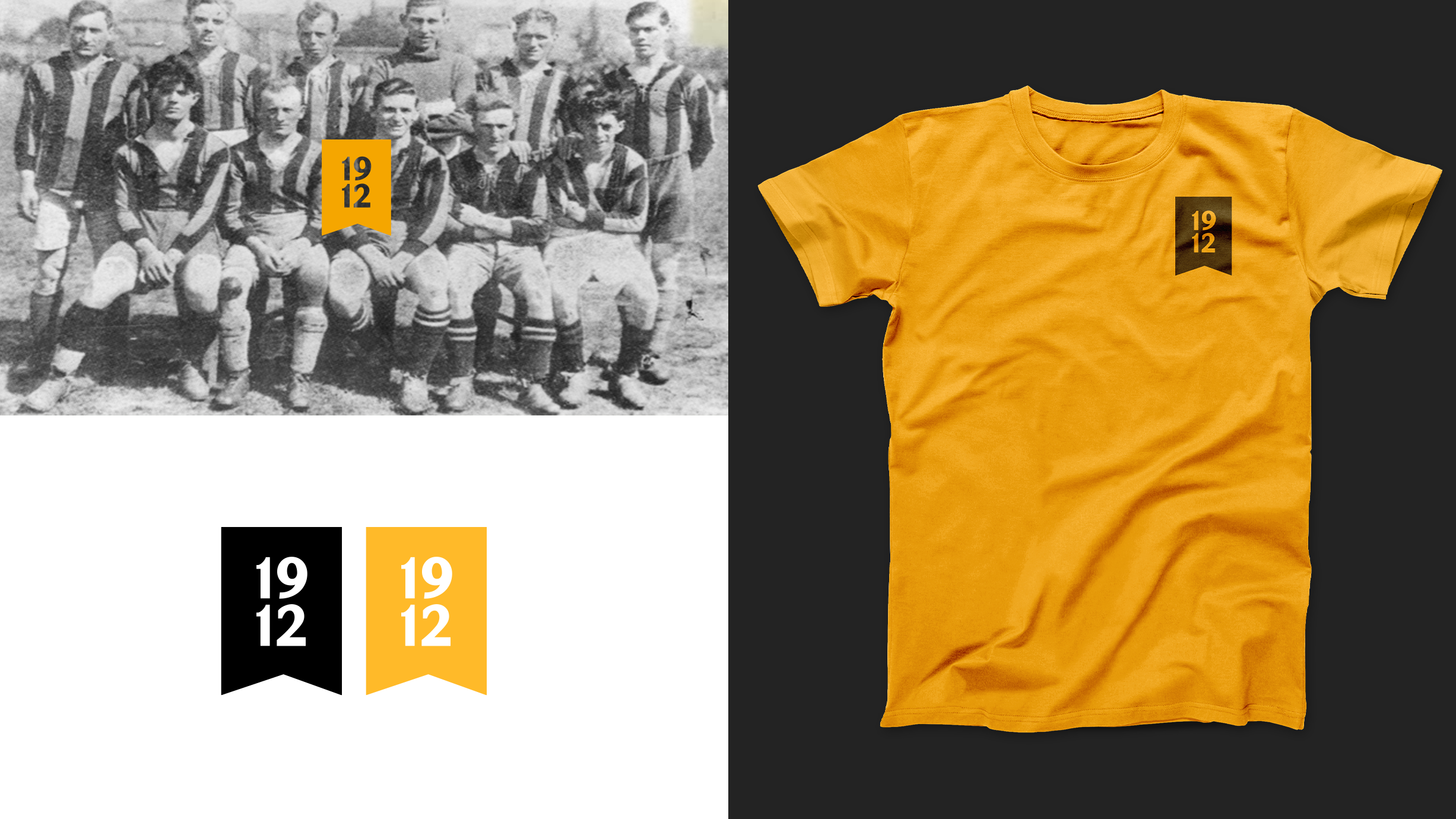
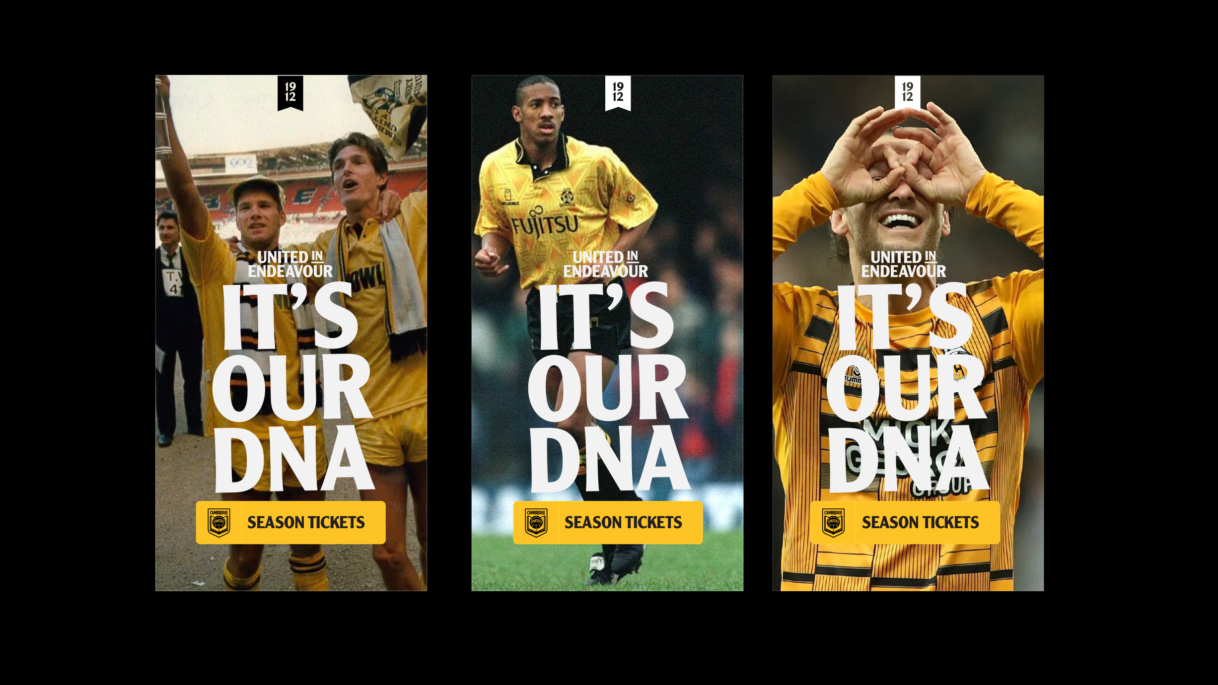
United in Endeavour, 1912 and other ways to represent
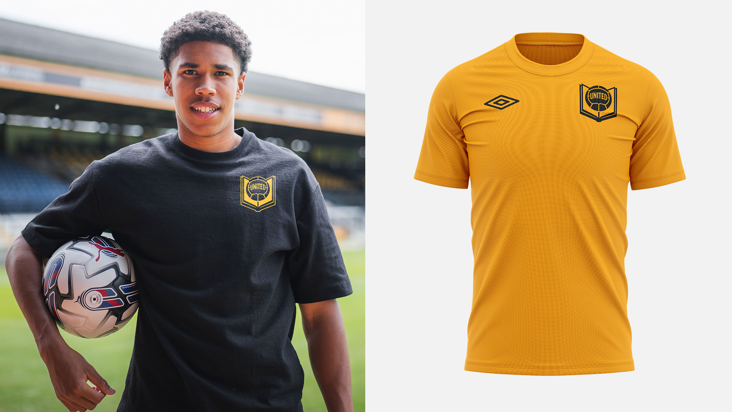
This crest's identity system includes a ‘United in Endeavour’ motto identity that closely aligns with the Crest’s typography, and a ‘1912’ bookmark heritage identity, which has obvious synergy with the Book and Ball concept.
Each of the identities are designed to work together, giving the Club a fresh, new look which has meaning and the Club's history at the heart of it.
Image
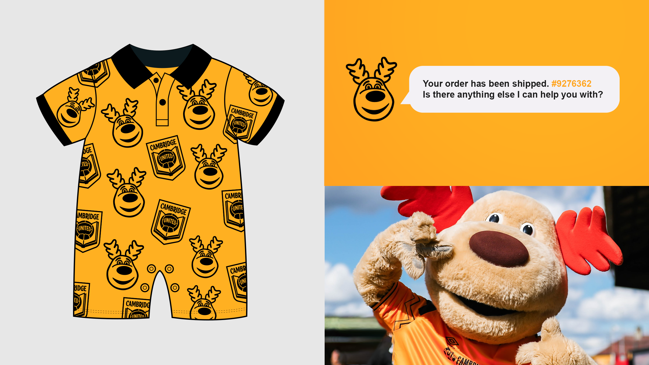
Marvin the Moose also has his own visual identity. As the Club continues to grow its junior supporter-base, we feel it’s important that Marvin has a to show his fun-loving personality across our platforms.
Just as with the other Crest designs, the entire Identity suite works in unison to provide a compelling visual brand for the Football Club that is born from its beginning.
Designer Chris Payne says...
"We saw in the fan feedback that some fans would like to see the book and ball reintroduced as the football club's identity. This design speaks to those fans and reimagines the book and ball for modern use.
"We also wanted to offer fans a more traditional design alongside Directions One and Two, which are more abstract designs.
"The Book and Ball is such an interesting idea and it's a concept that is not new to Cambridge United fans. We spent a long time looking at the book and ball design of the 1970's and sought to reimagine it.
Image
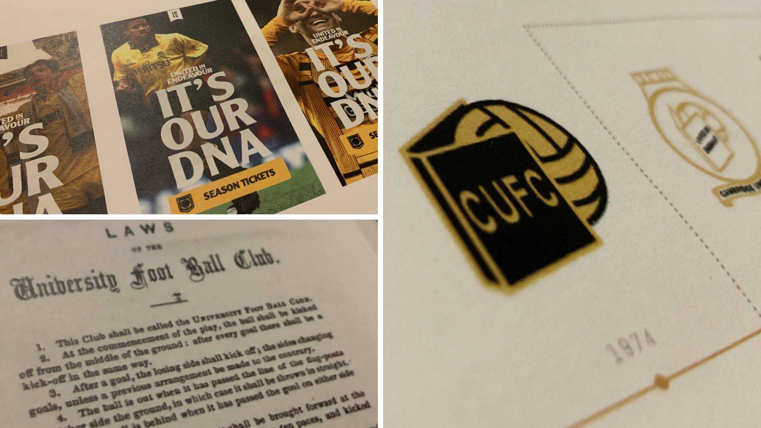
"Similar to Direction Two, the strength of this design is its story. The book and ball ties back to past identities, as well as the rules of football being formalised in Cambridge, it also provides a subtle nod to Cambridge's renowned education system.
"Balance and symmetry are essential in football club crest design, so we spent a lot of time looking at the visual relationship between the book and the ball and how these two elements could work harmoniously together."