Remote Stream
Direction One - Evolution
Direction One is an evolution of our current Crest to a simpler, sleeker and more modern design...
This approach explores a stylistically evolved identity for the Club with a design that retains a similar feel and shape to our two most recent Crests.
Image
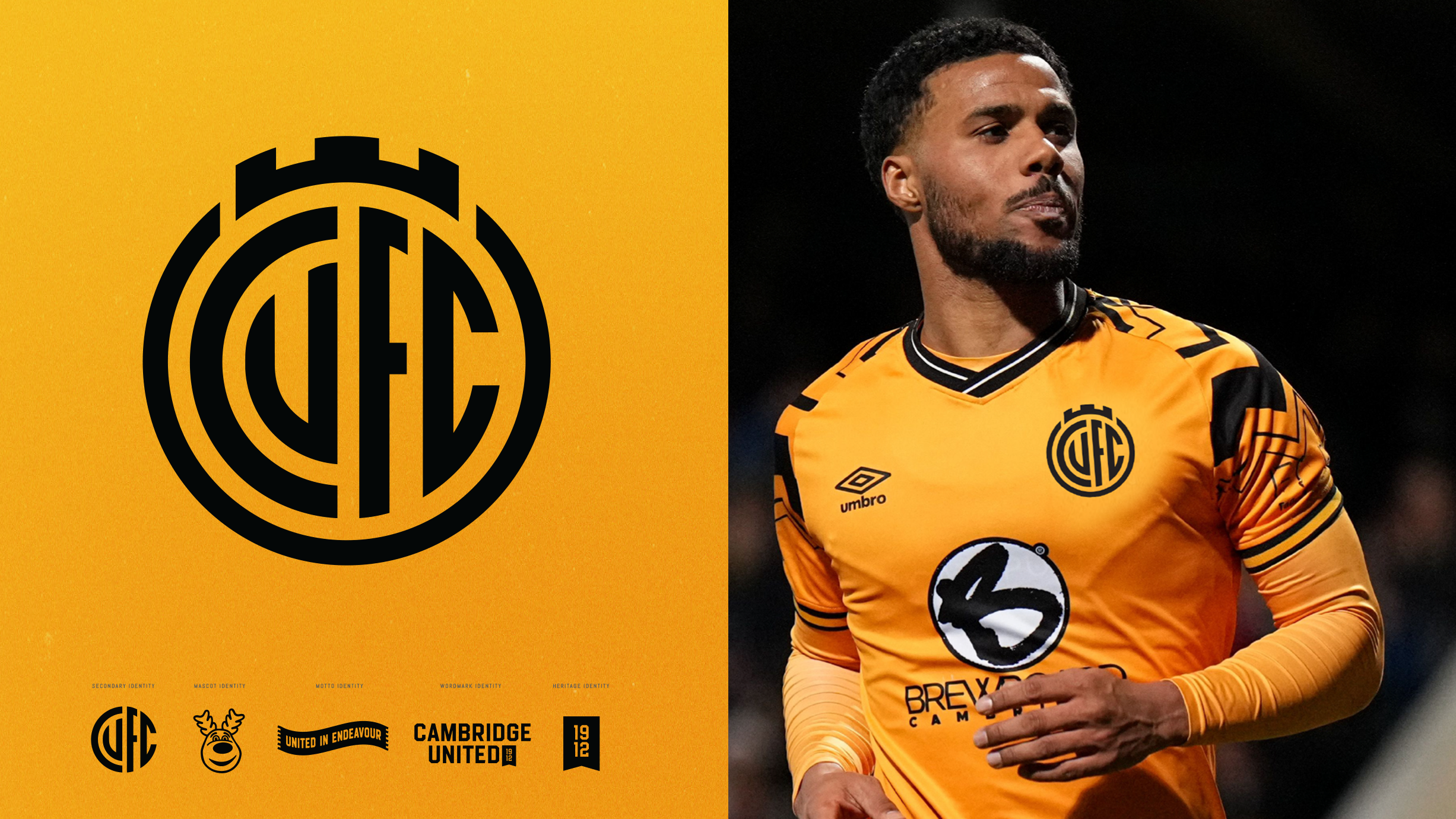
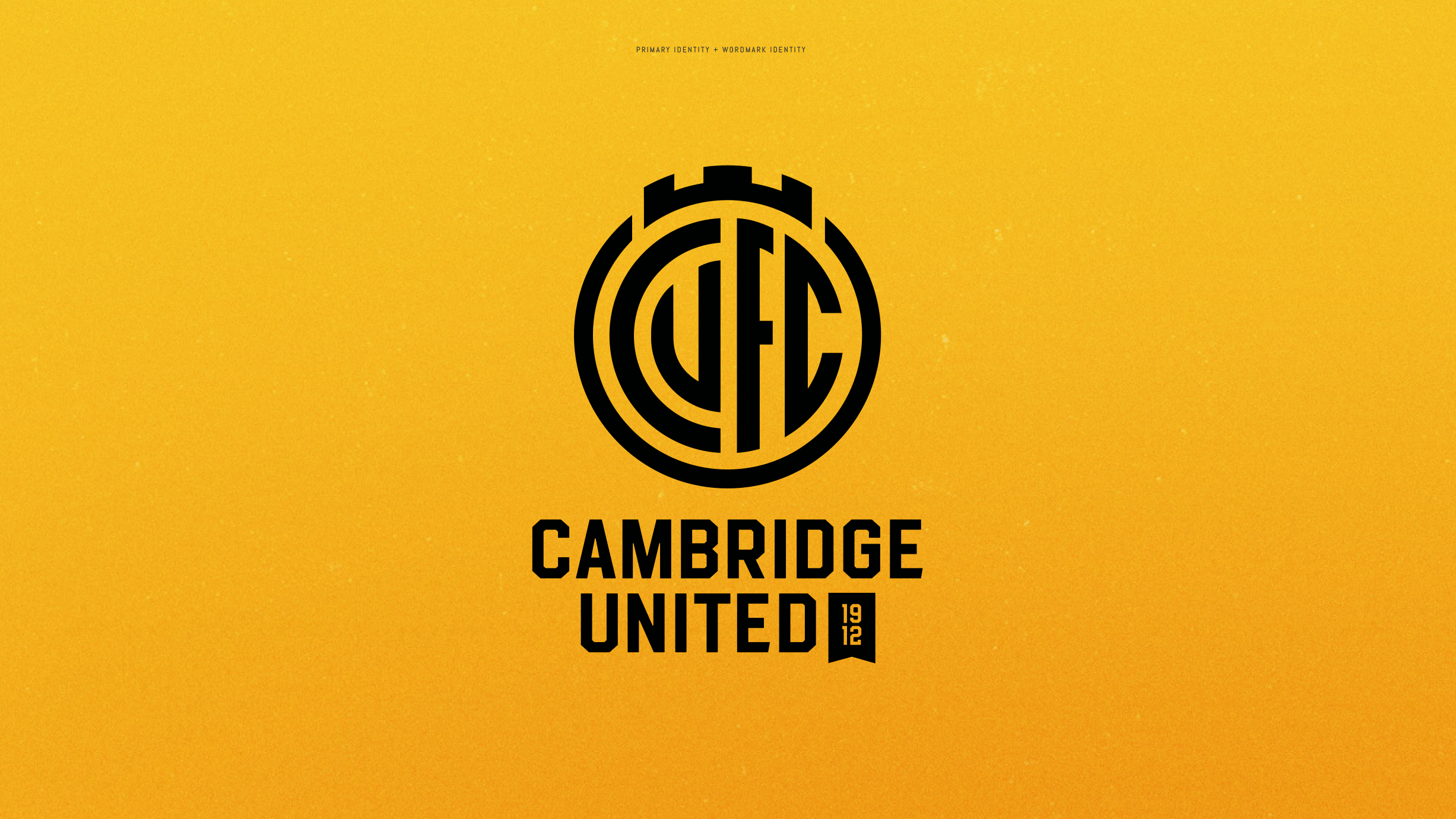
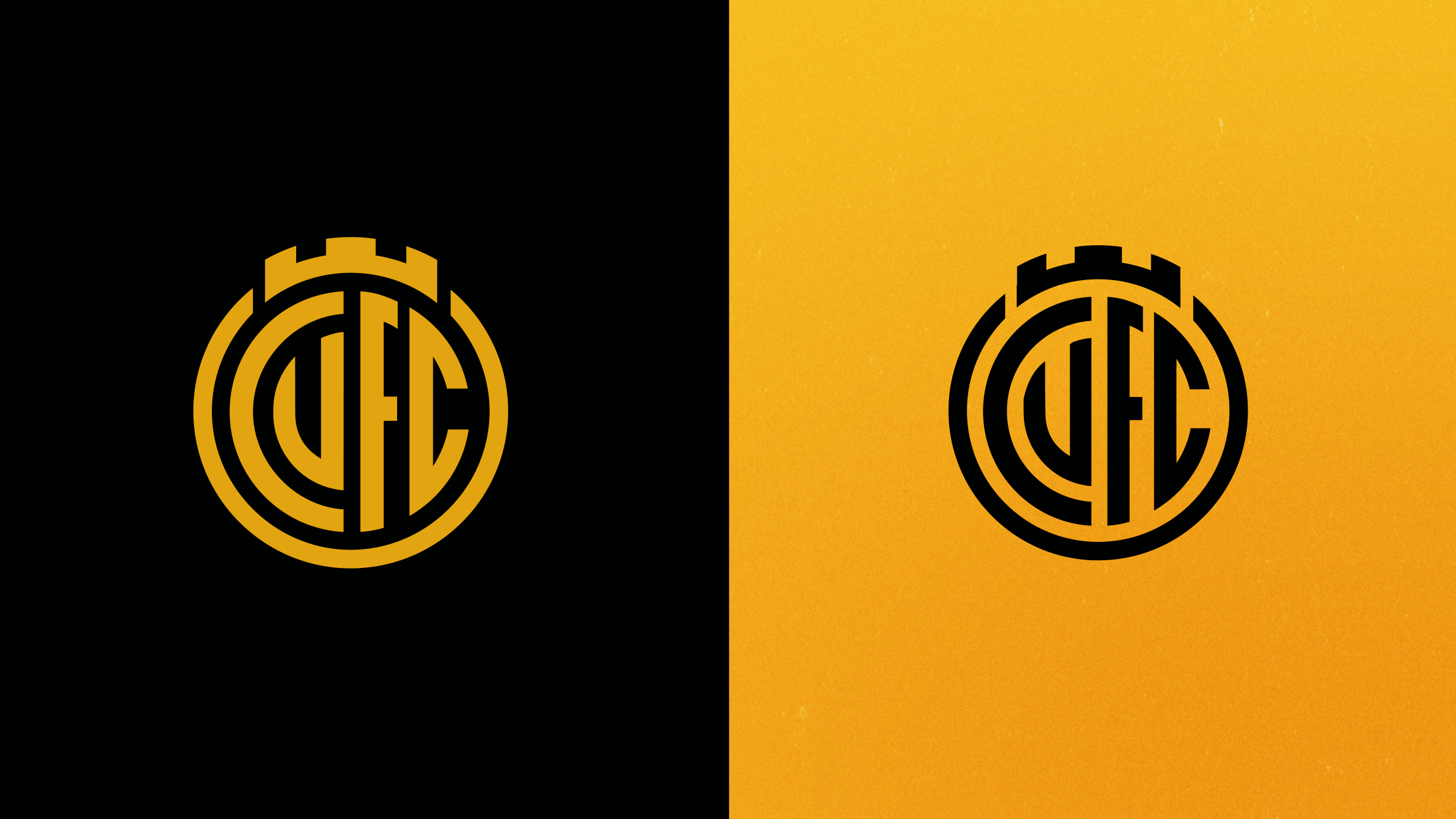
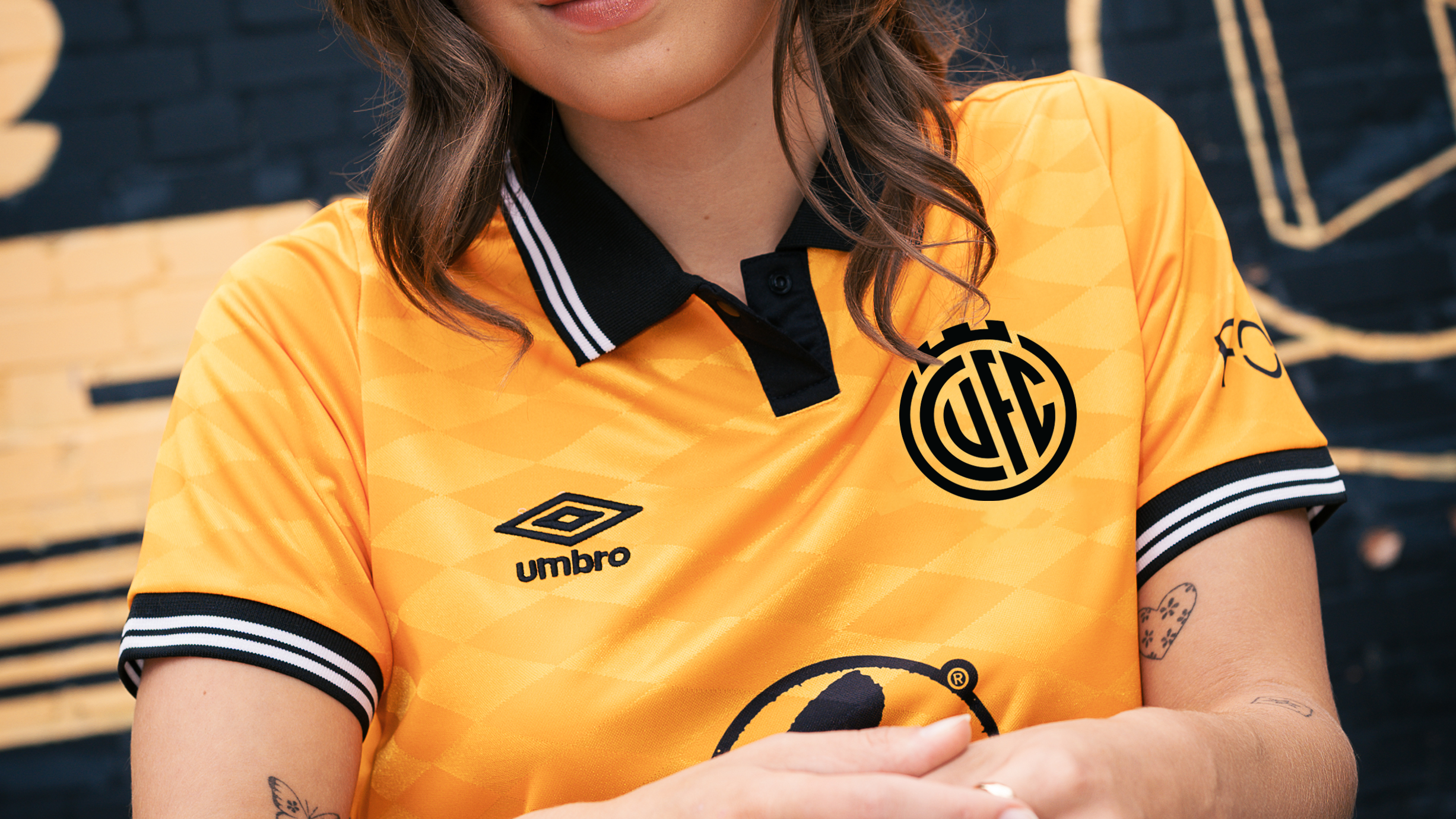
The new design retains some of the key features from our current Crest including the shape and the representation of the Magdalene Bridge. One major difference is that instead of the lesser-used CU initials being shown at front-and-centre of the design, it displays the Club's full CUFC initials.
The Monogram style of Direction One is also a nod to the Club's original Crest, the Abbey United shield.
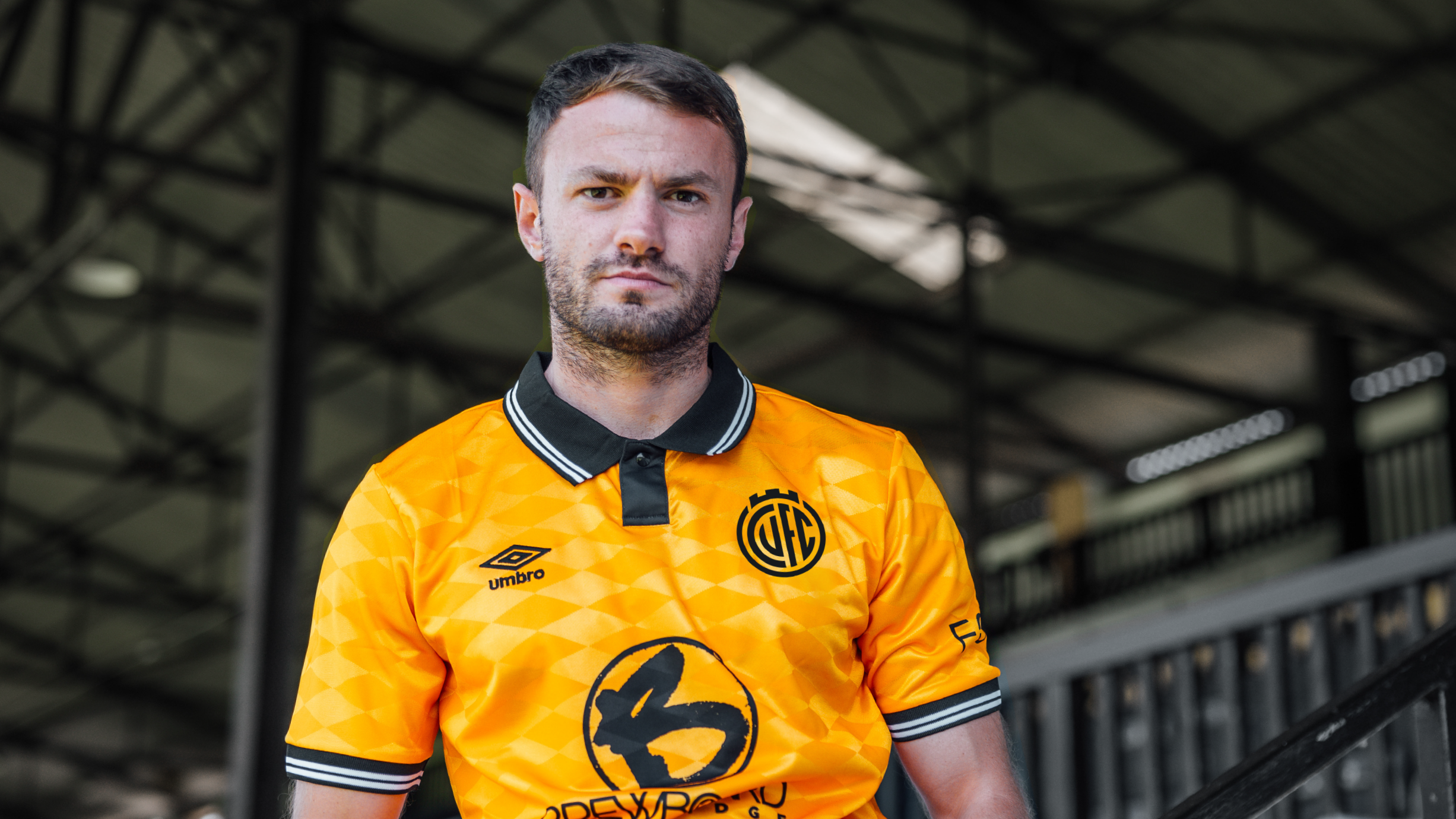
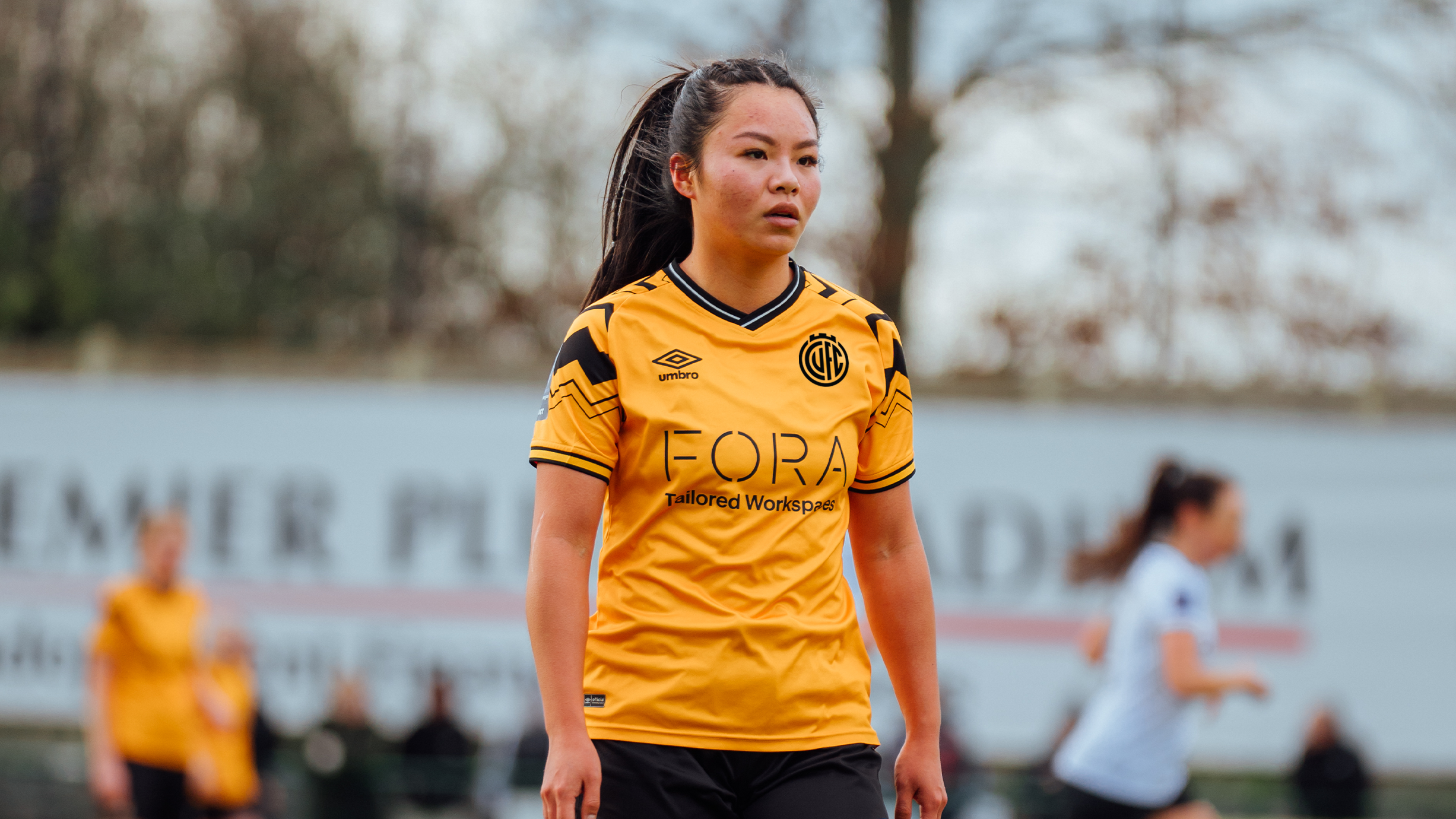
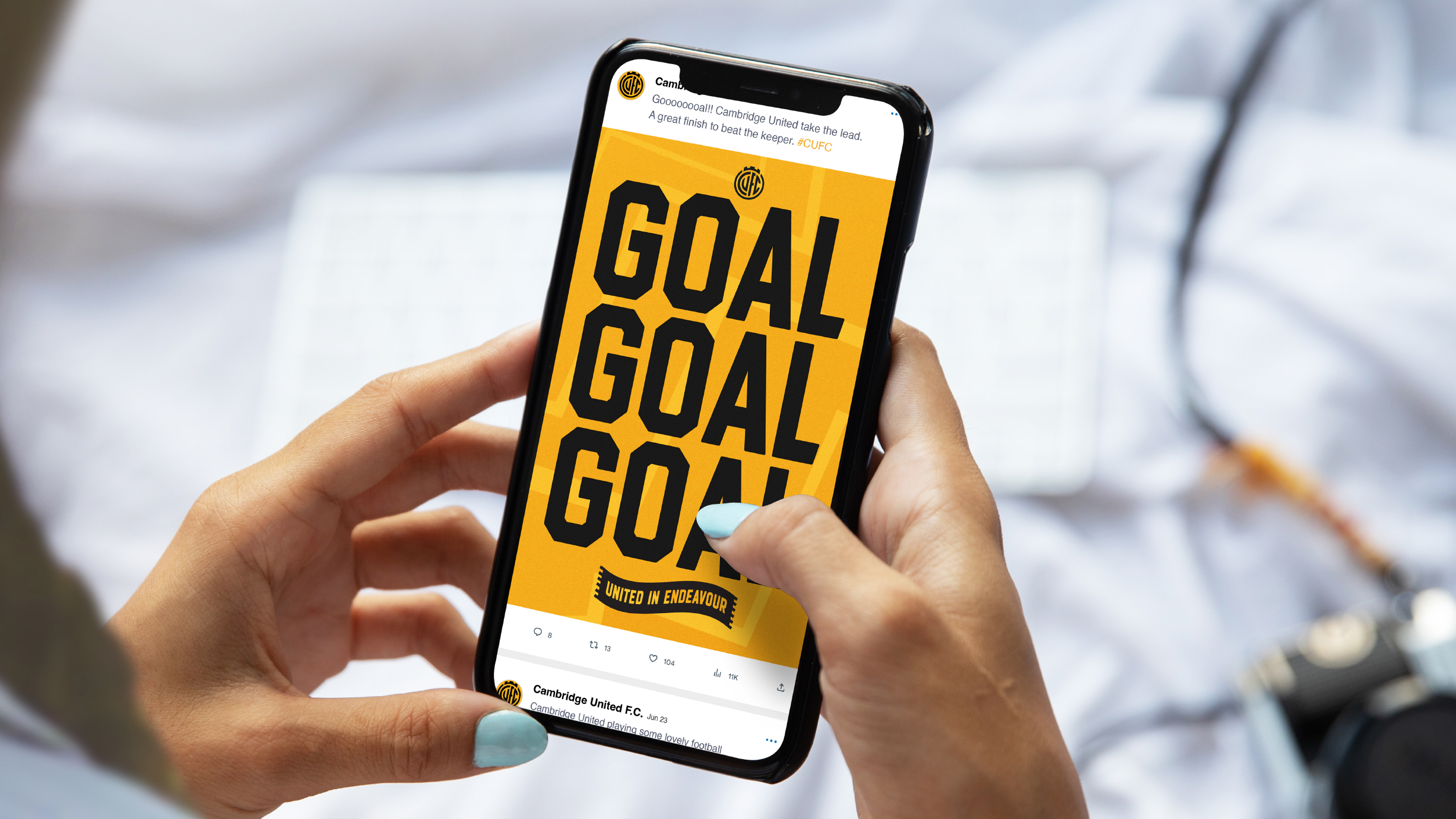
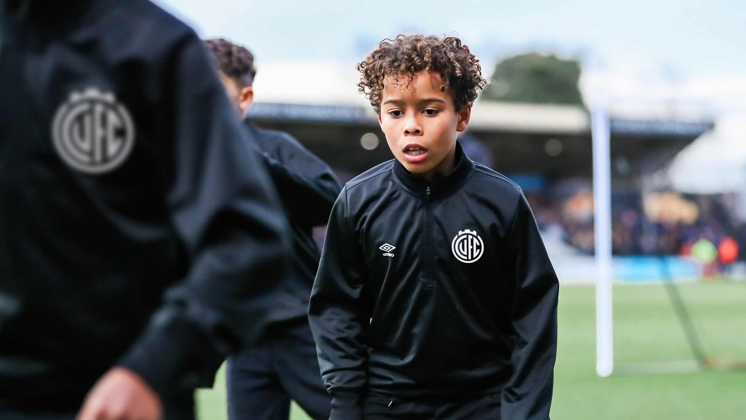
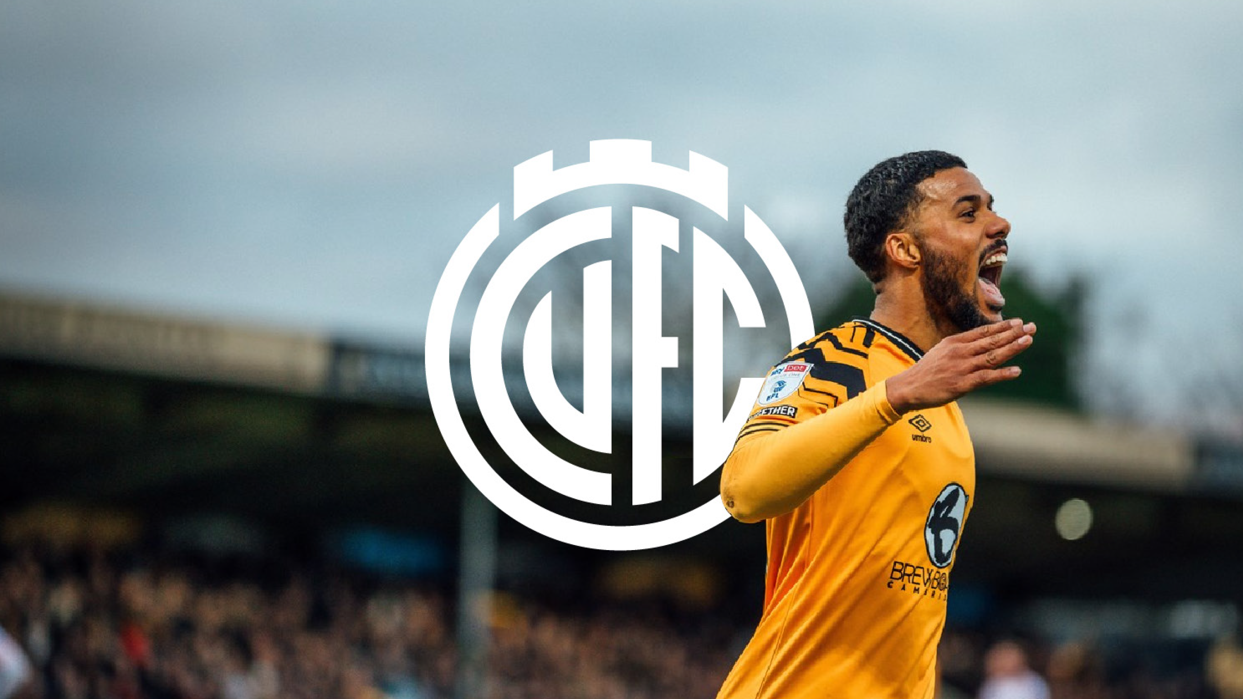
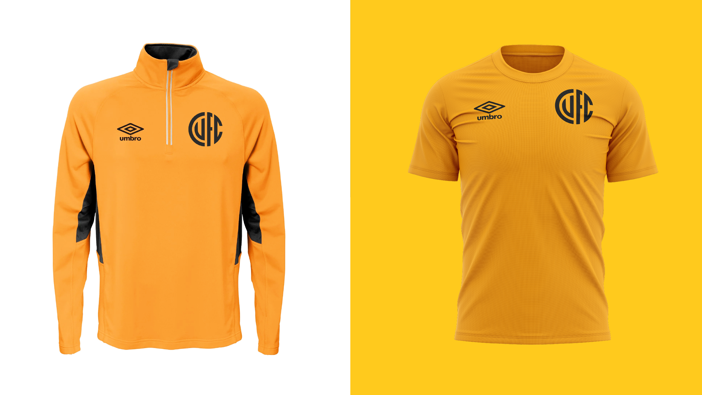
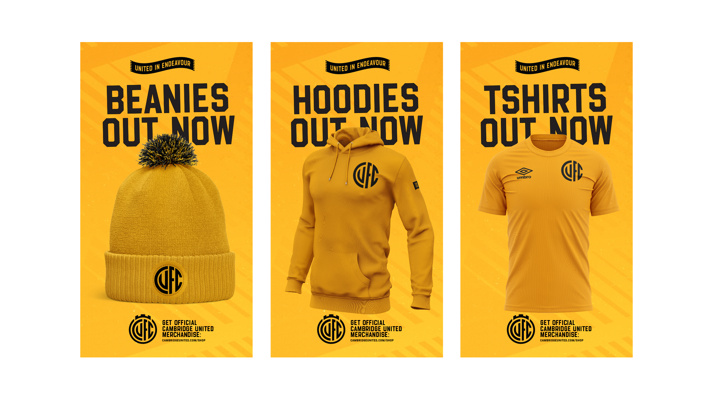
It’s designed to be multi-purpose and function everywhere it’s used, across all colours. It's built to work on match shirts, digital media, merchandise and print.
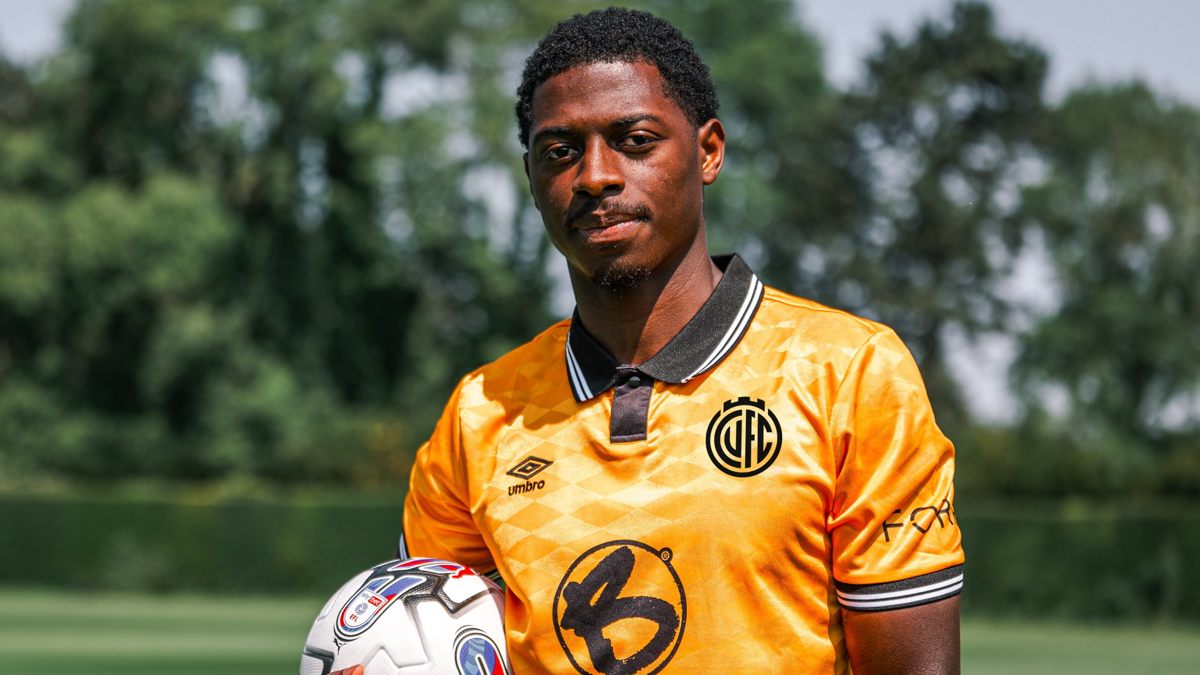
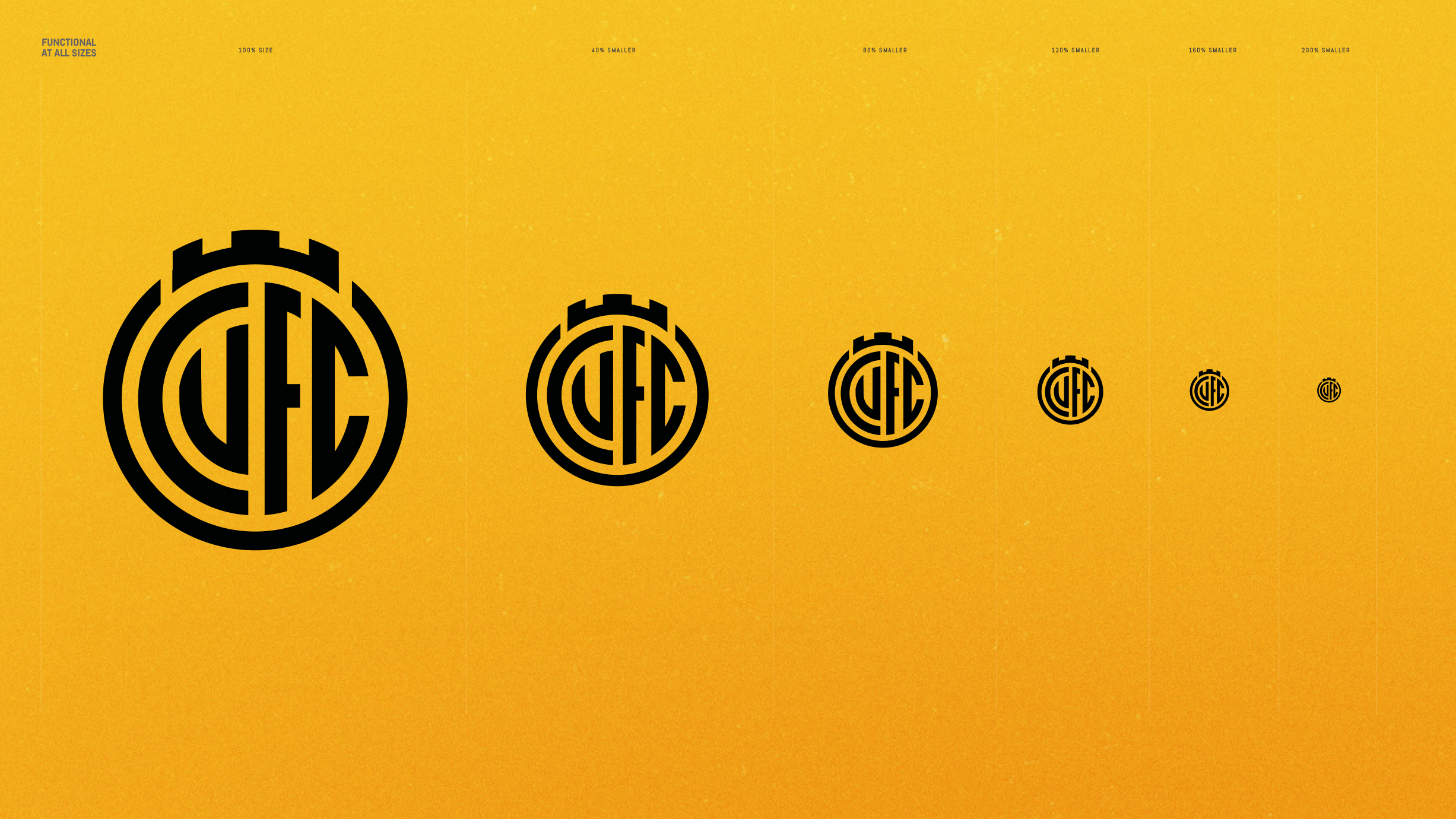
Designed to adapt
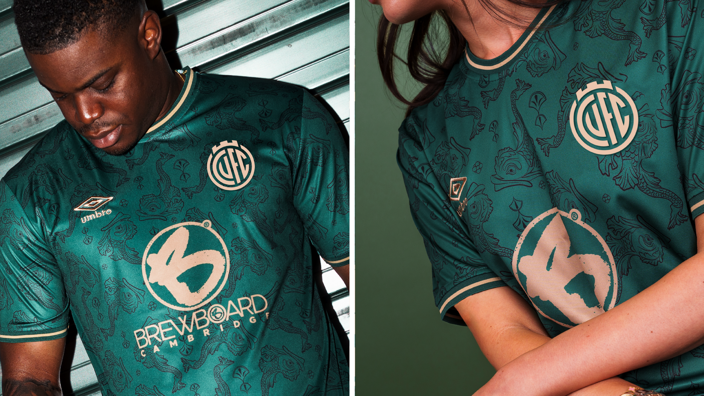
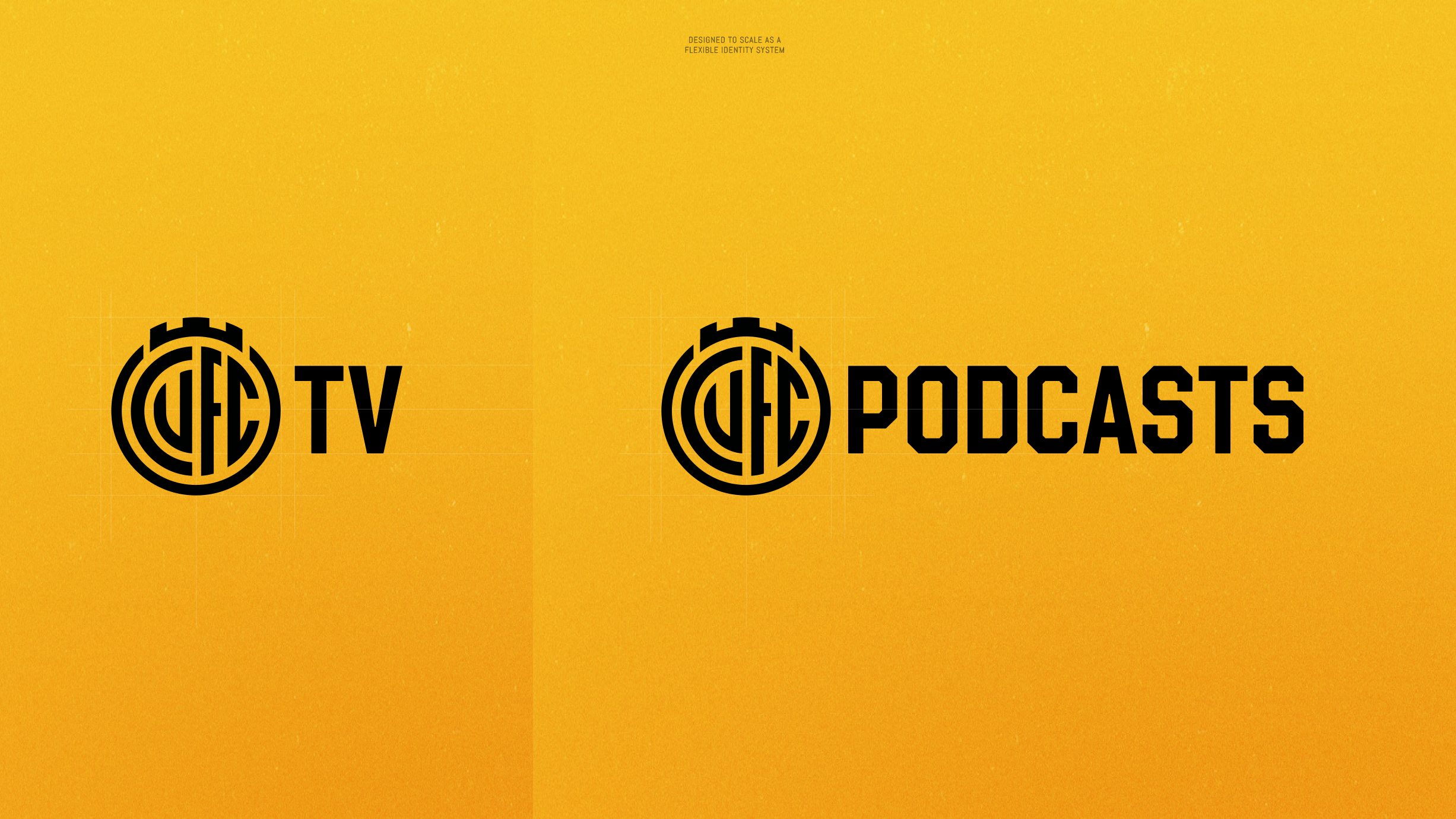
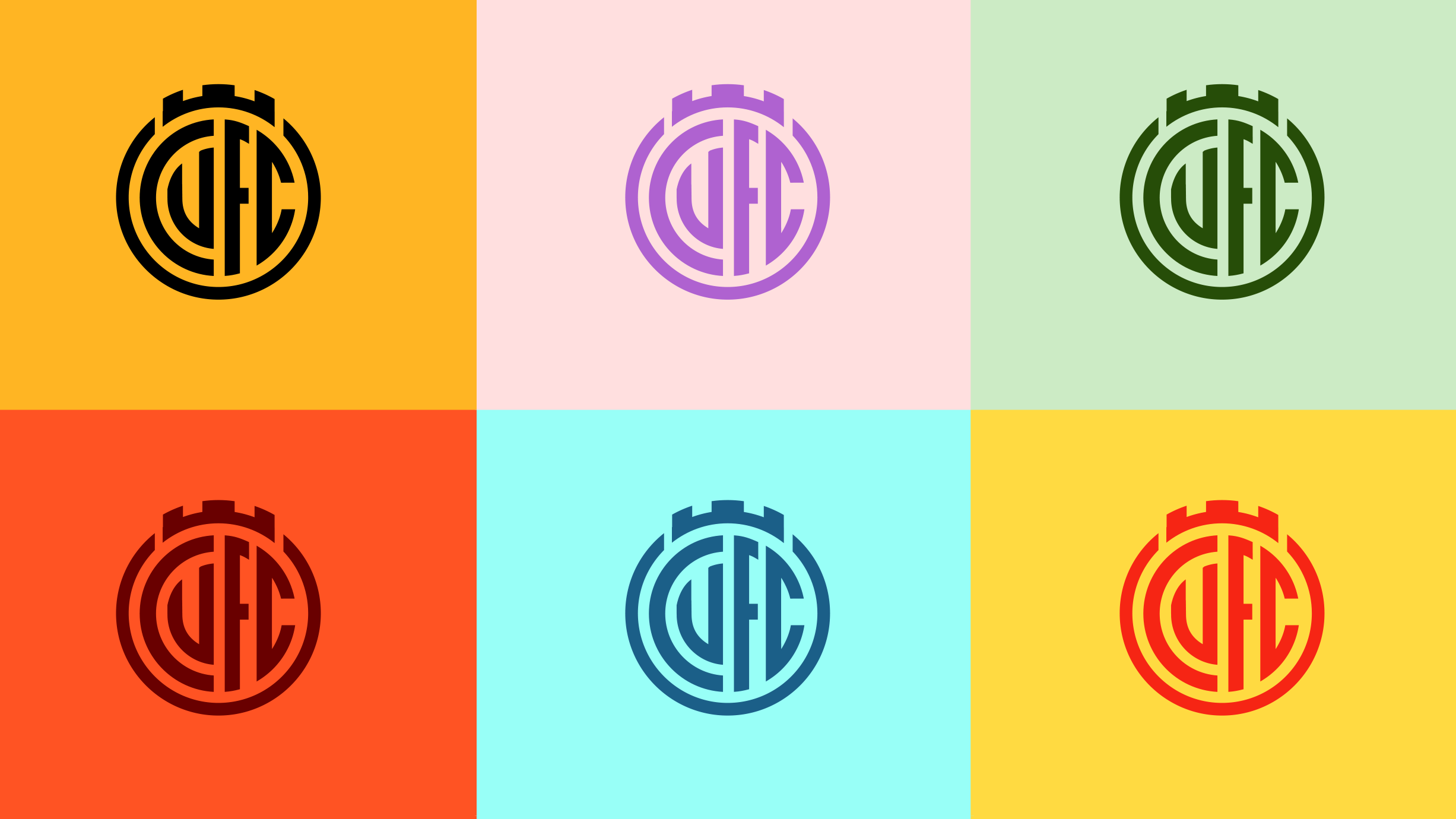
A key feature of this new design is its flexibility. In today's modern world, it is important that a football club’s identity can adapt to multiple scenarios.
This new identity was designed to work across all places in which it will be seen - from social media to print media, large sizes to smaller sizes.
In addition, this identity was designed to change colour when needed.
Image
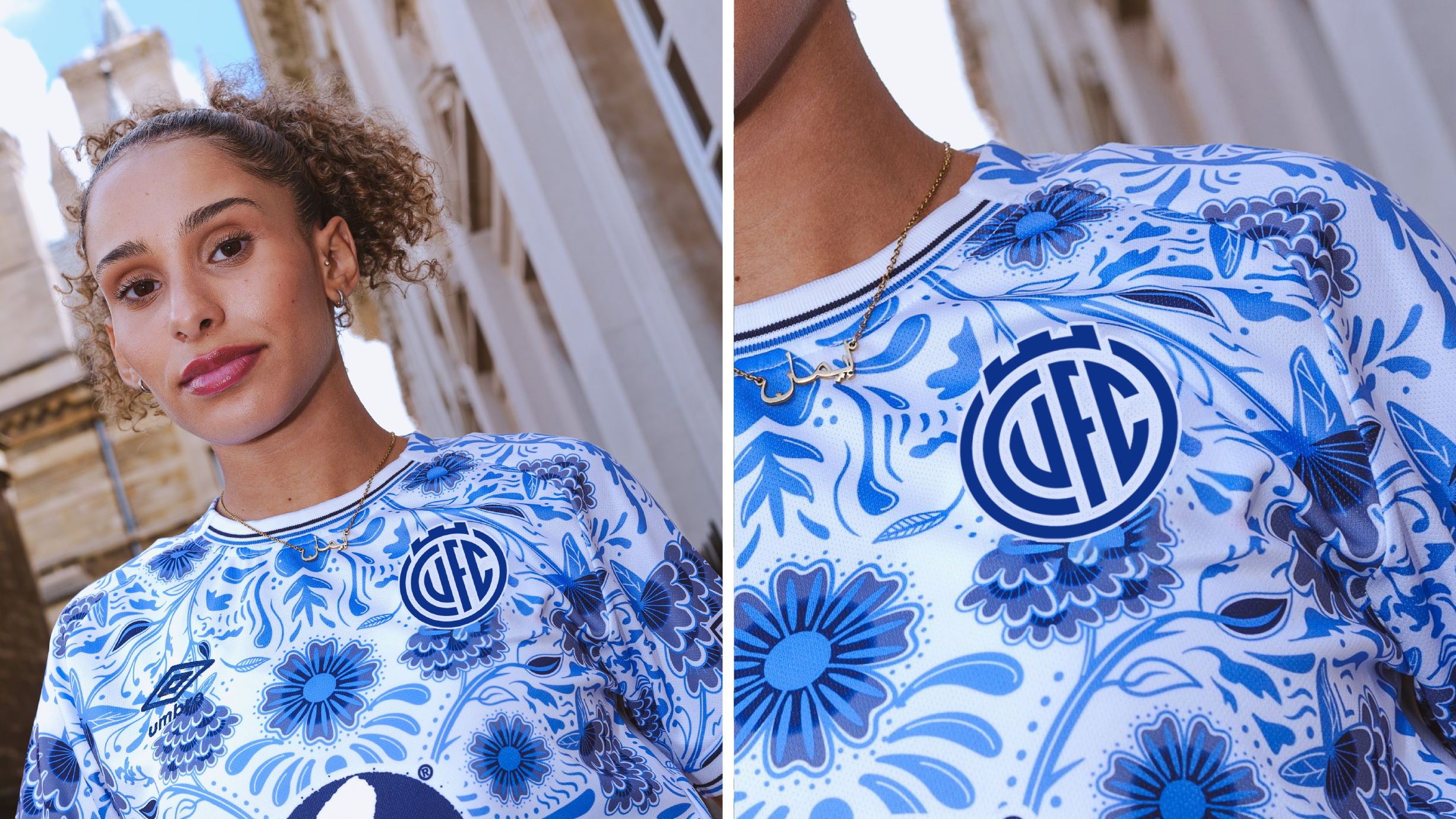
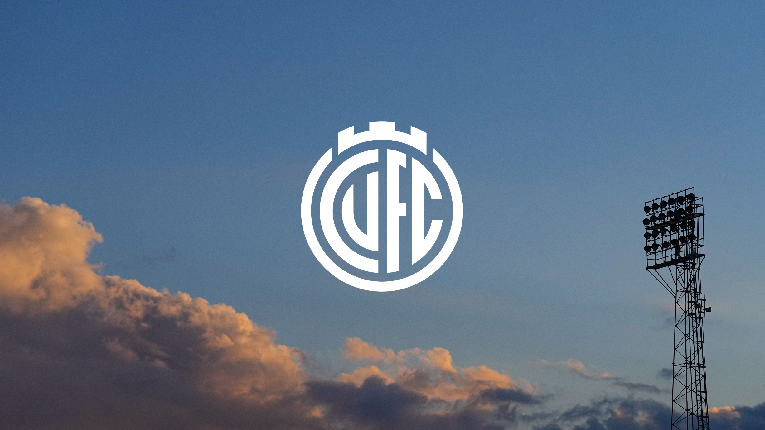
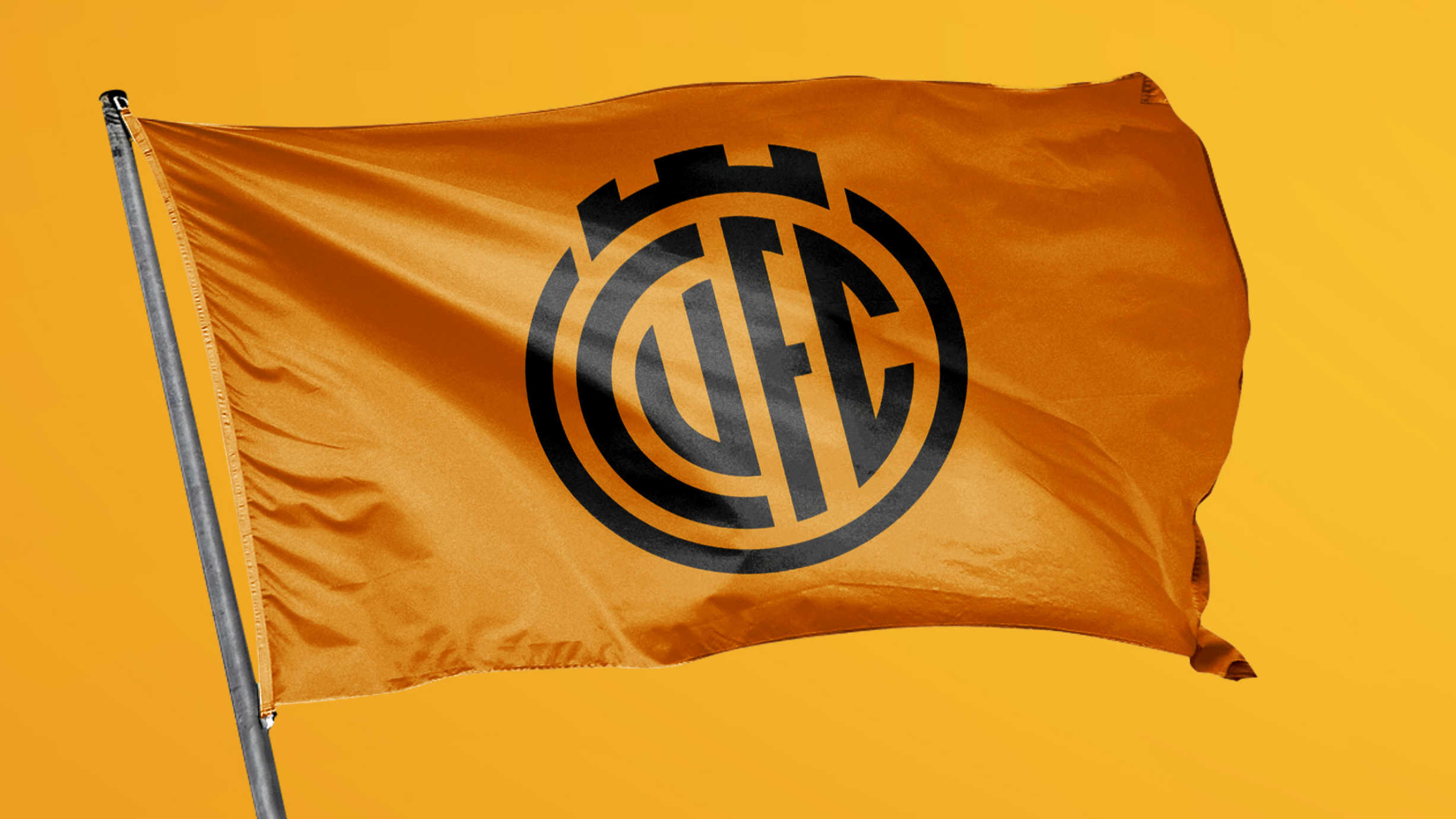
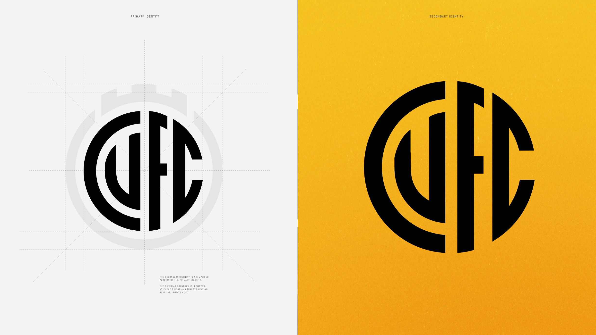
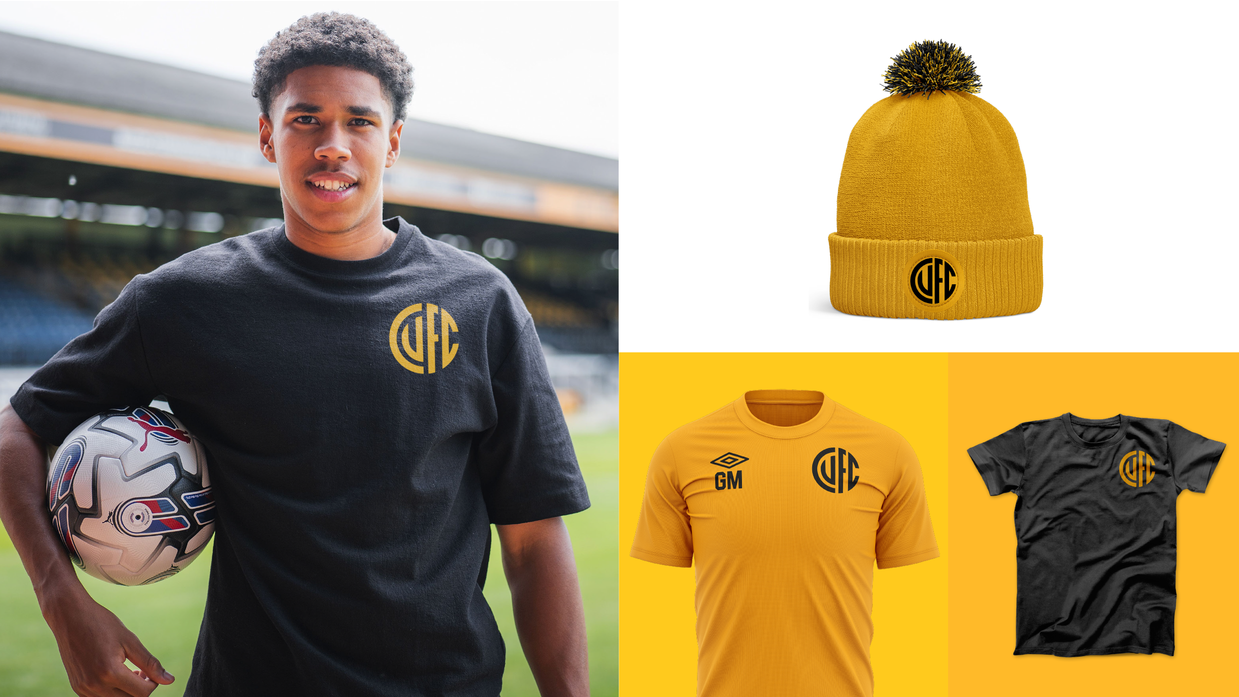
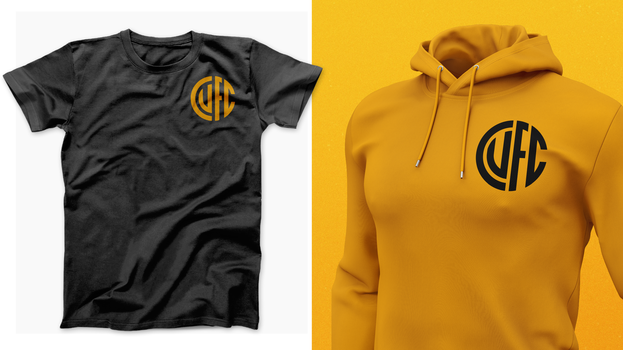
Secondary identity
This progressive new identity can also be simplified further when needed by extracting the CUFC initials from its casing, giving the Club a secondary identity.
This secondary identity can be used across training kits and select merchandise offering the Club more flexibility, and offering our fans more choice, and more ways to represent the Club.
Image
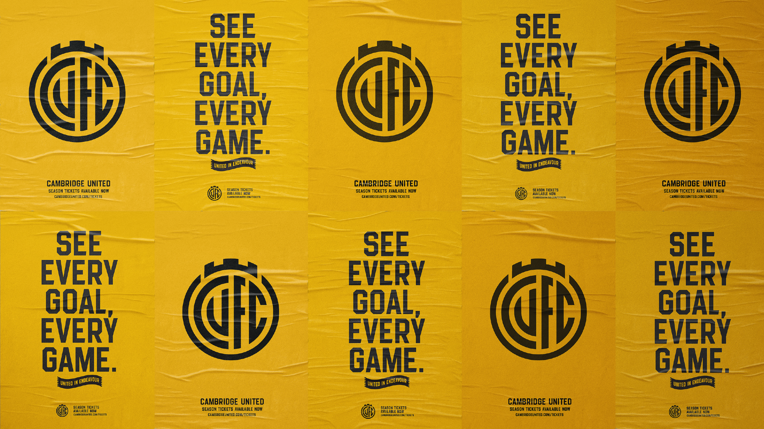
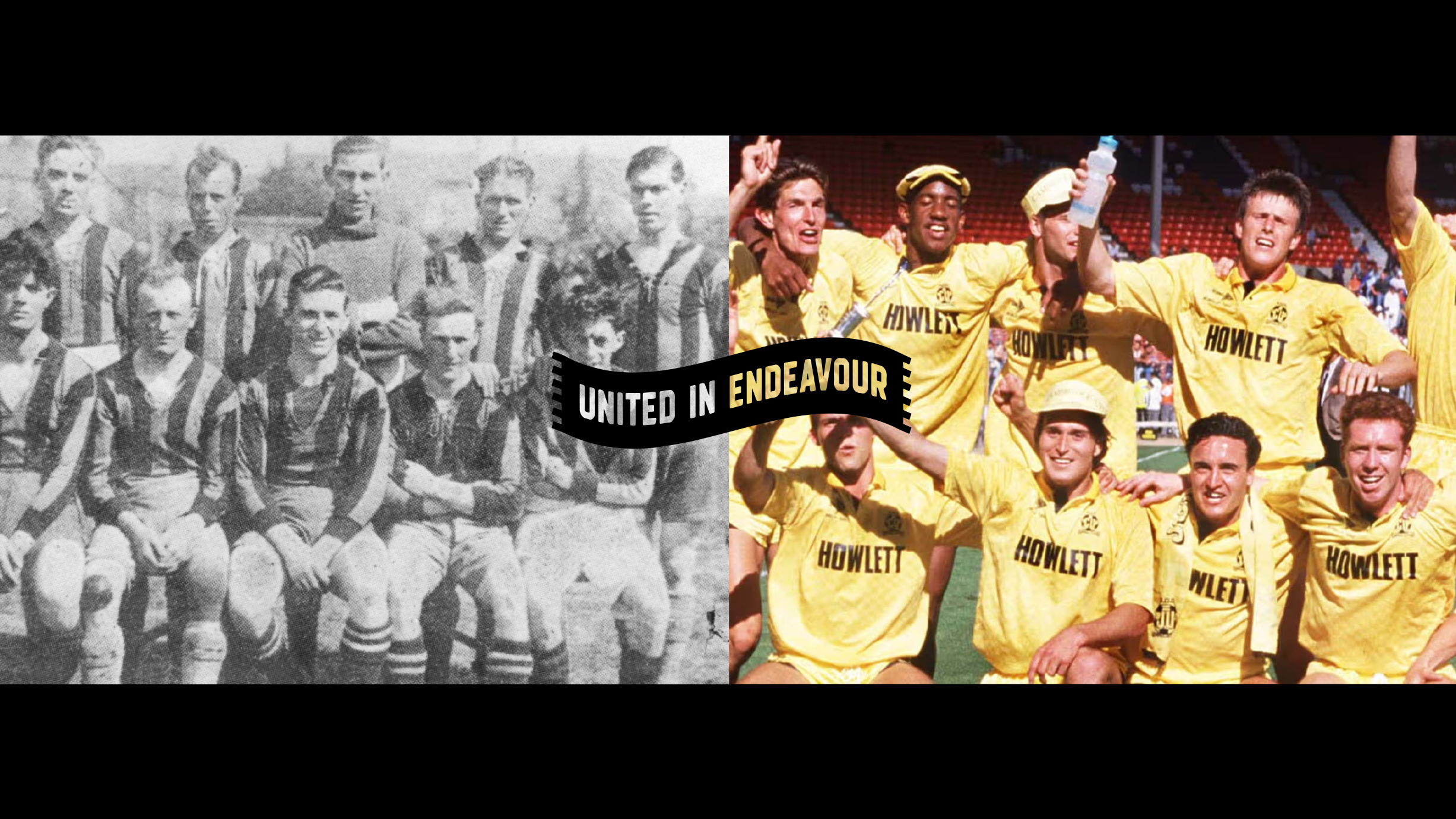
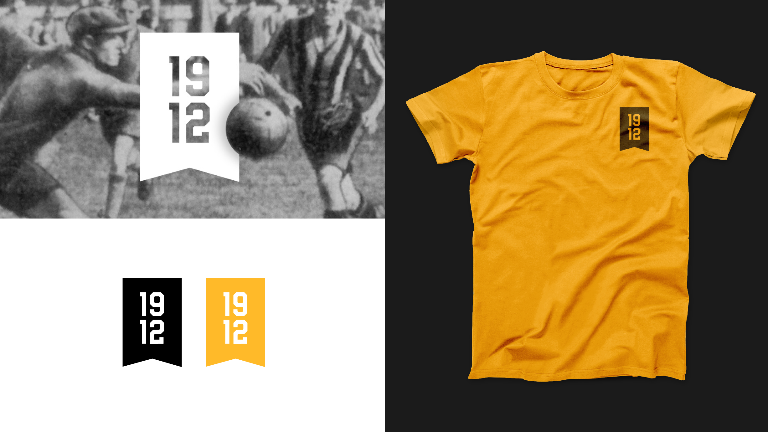
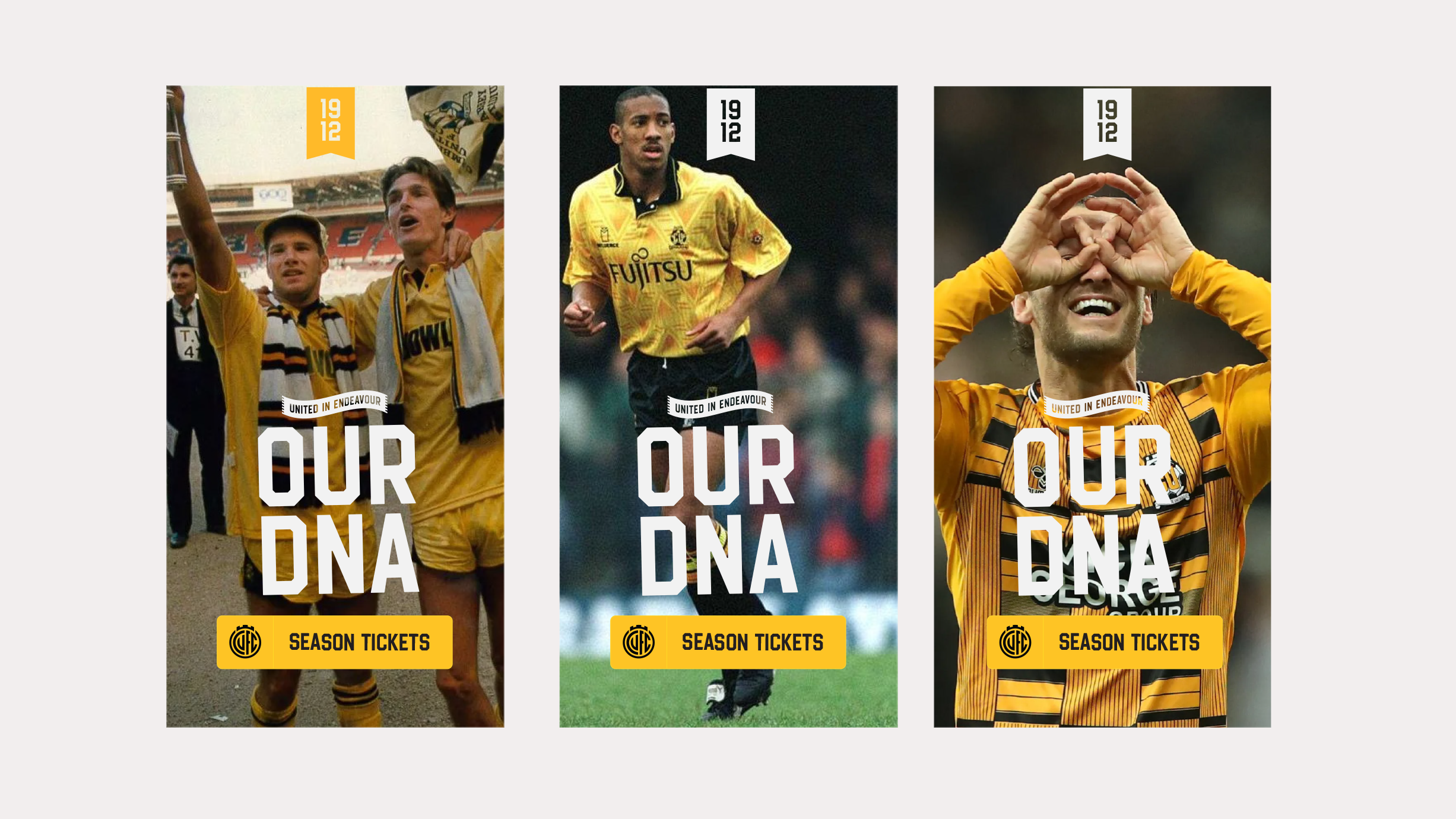
United in Endeavour, 1912 and other ways to represent
In addition to the secondary identity and font that works alongside the Crest, this design direction also comes with a complementary identity system that includes a ‘United in Endeavour’ motto identity and a ‘1912’ heritage identity.
We know that United in Endeavour and the Club’s founding year are important aspects of our history - and with these icons we can bring symbols of our past into our future identity.
As well as using these icons to represent our past and fan-culture, they can work in tandem in modern media and on merchandise as accompanying symbols to the Club Crest.
Each of the identities are designed to work together, giving the Club a fresh, new look which has meaning and the Club's history at the heart of it.
Image
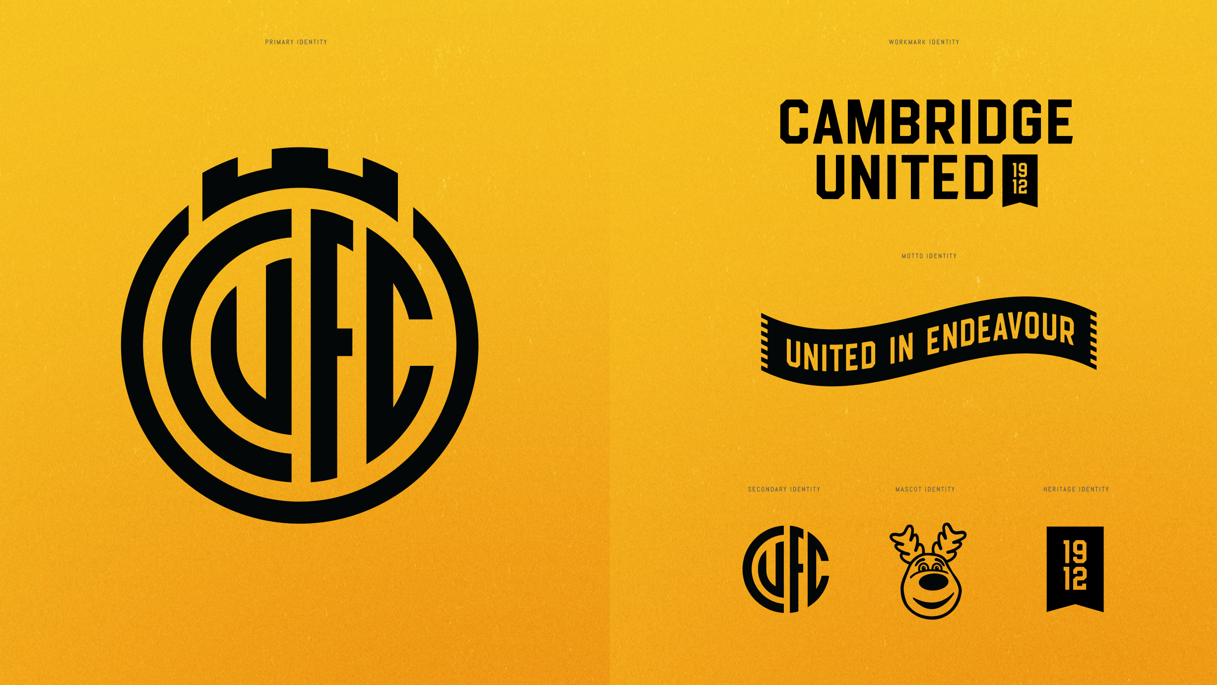
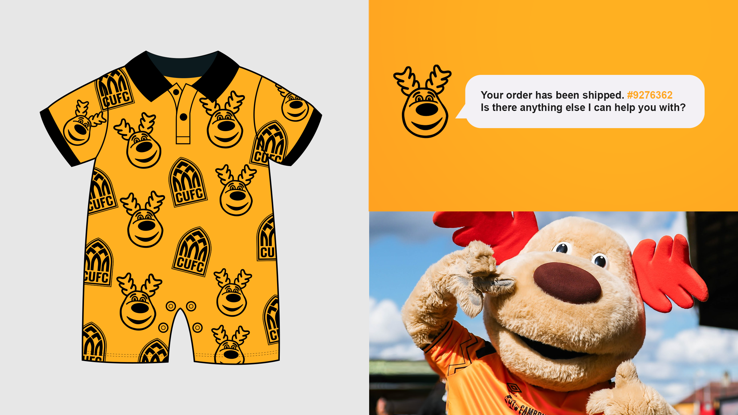
Marvin the Moose also has his own visual identity. As the Club continues to grow its junior supporter-base, we feel it’s important that Marvin has a digital icon to show his fun-loving personality across our platforms.
With the entire suite working together, there are multiple ways for fans to represent the Club and for the Club to represent itself.
Designer Chris Payne says...
"Designing for the future is important, but so is fan feedback, and so when reviewing feedback, we noticed that a good portion of fans felt we should simply modernise the current identity in some way - so that become our approach for Direction One. We looked to modernise the current identity and evolve it into a more practical and future facing design.
"We worked really hard to retain key features of the existing design, such as the bridge and the turrets and the basic shape of the crest.
"Wet also we saw this as an opportunity to take out some of the features of the current design that might not be working so well in this modern age, such as the 1980's football, the small banner at the bottom of the crest, and the CU lettering - which we understand is offensive in a few different languages. So, as part of the identity's evolution, we simplify the design and reintroduce the Club's full initials, CUFC"
"We love how this new identity has a familiarity about it, and how it is highly adaptable to multiple scenarios. When designing an identity for a football club, you must always think about how the design will work across all places in which it is seen, from digital media, to print media, on the player's shirts, on fan merchandise, outside a stadium, on advertising and more. There is a lot to consider and this identity works exceptionally well across all places in which it will be seen."